Hover Actions
A property triggered when your mouse pointer hovers over an element
Description
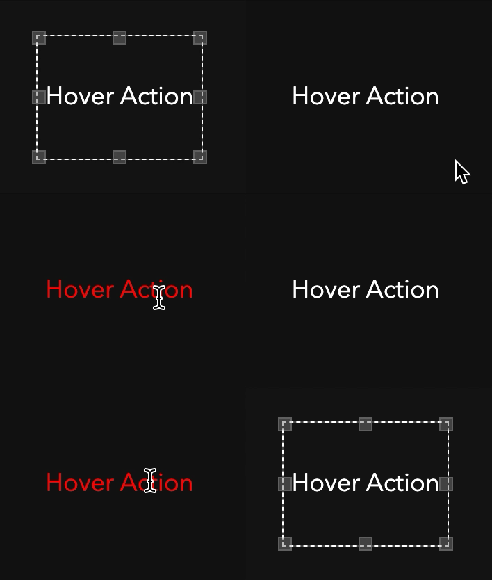
Hover actions act like action buttons but are triggered when your mouse pointer hovers over an element. Hover actions are often used on buttons to indicate that they are clickable.
How To
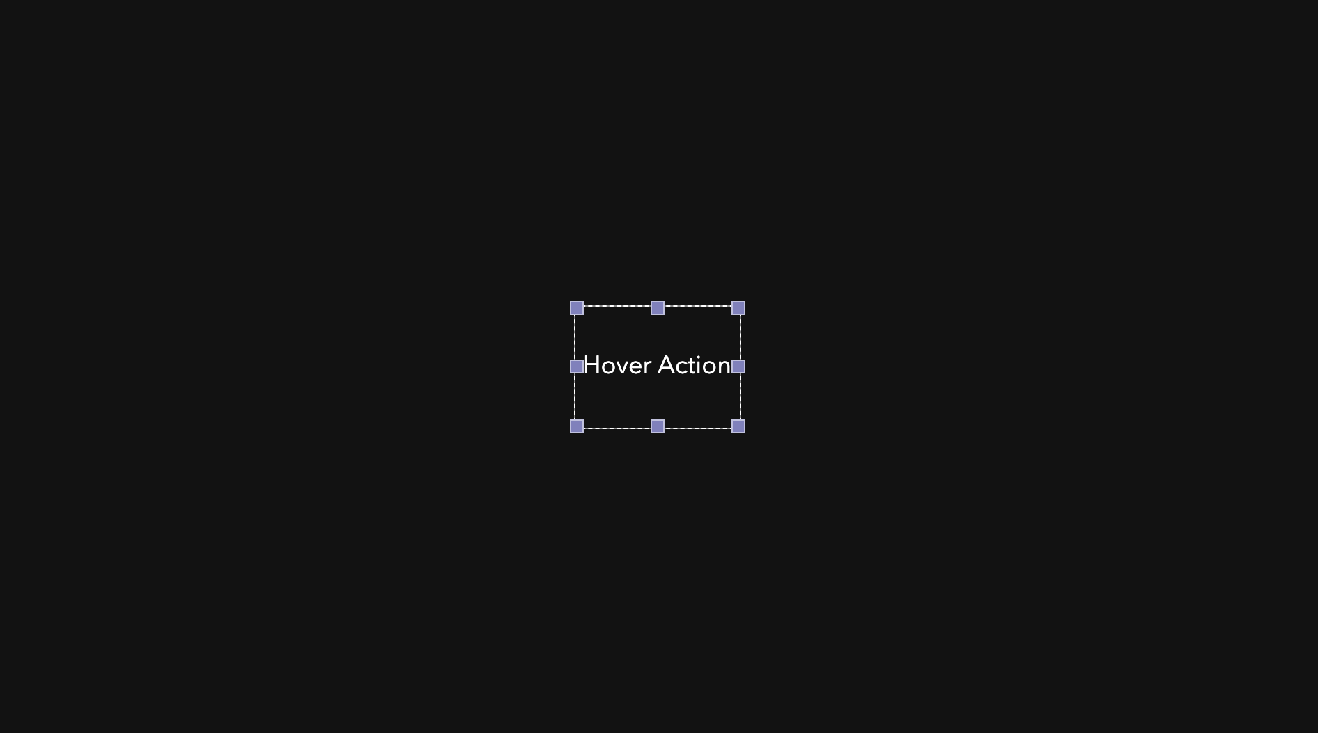
First, select an element that you want to act as the control for the hover action. That means this element will activate the hover action when a mouse pointer is hovering over it. Elements often used are action buttons, images, and text.

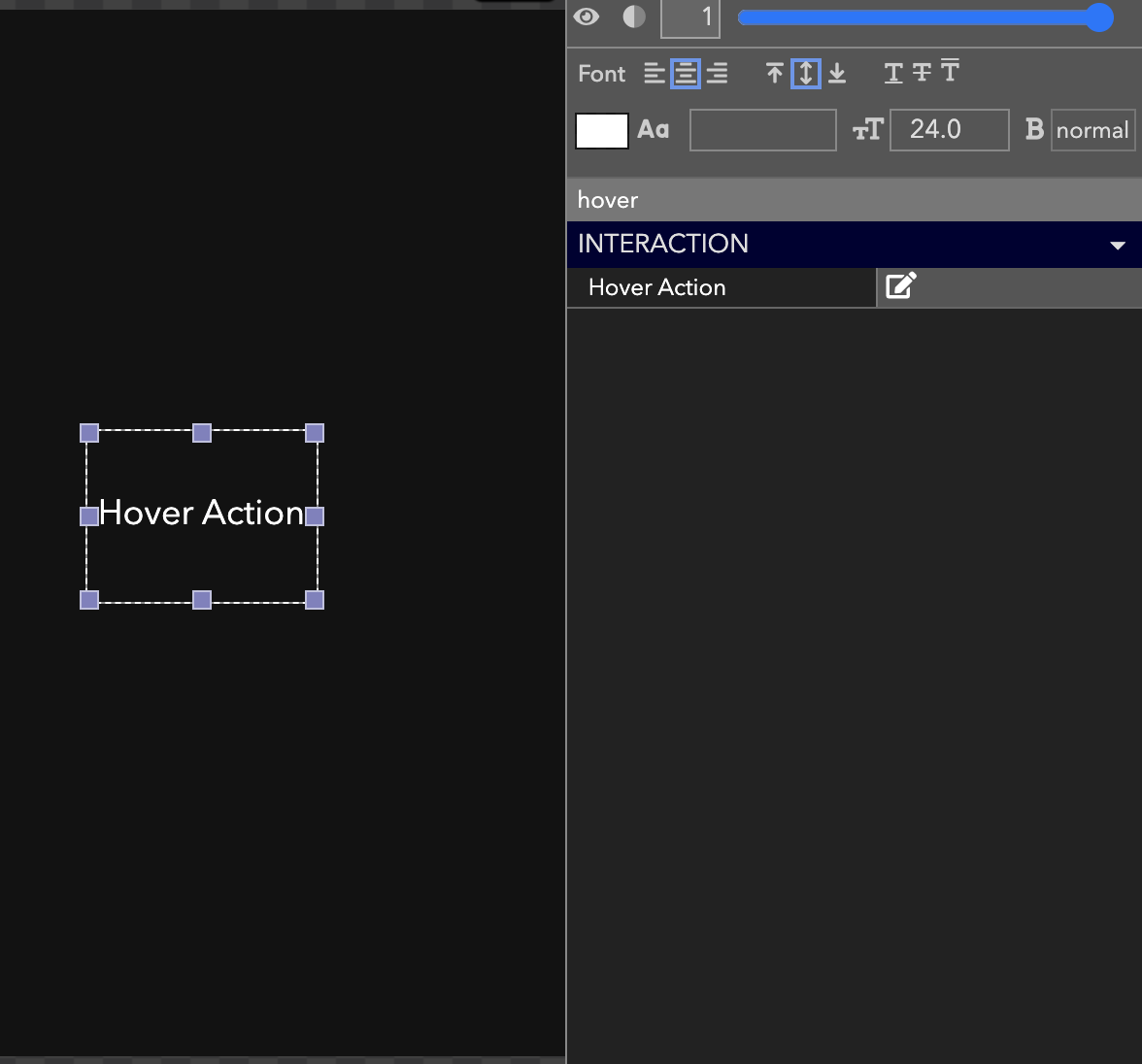
Then, search hover action in the Advanced Properties panel and select the icon.

To set the hover action click the icon and use the Action Builder to indicate which elements and properties should be modified when a user is hovering.

Note
Hover actions are visible only to the user hovering over that element.
Lastly, click save and test the hover action by hovering your mouse pointer over the element you just set up.

Updated about 4 years ago
