Advanced Properties Glossary
Access Key: The keyboard shortcut access key for an element.
Admins: The users that can manage the workspace.
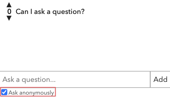
Allow Anonymous Questions: Allow users to ask questions anonymously.
Allow API Access: Give the site loaded by this iframe the access to the ohyay API.
Allow Camera Access: Whether or not the content of this iframe should be able to access the camera/microphone.
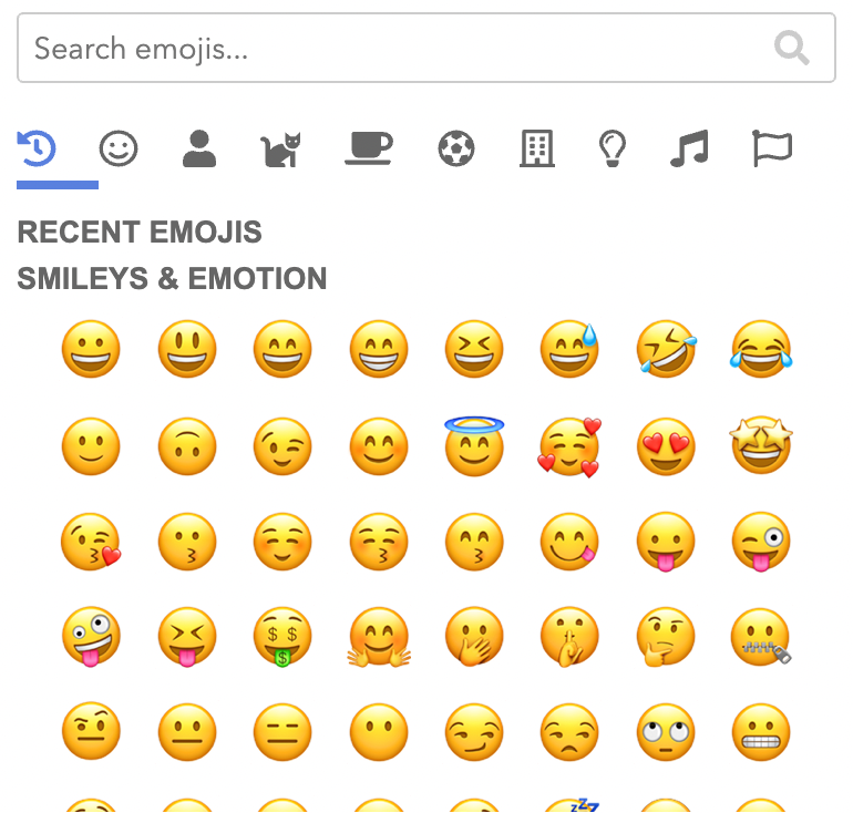
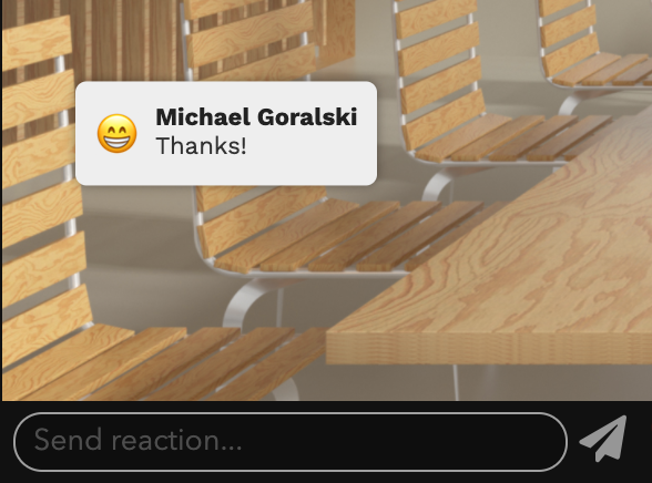
Allow Custom Reactions: Allow users to choose custom reactions to send to all other users.
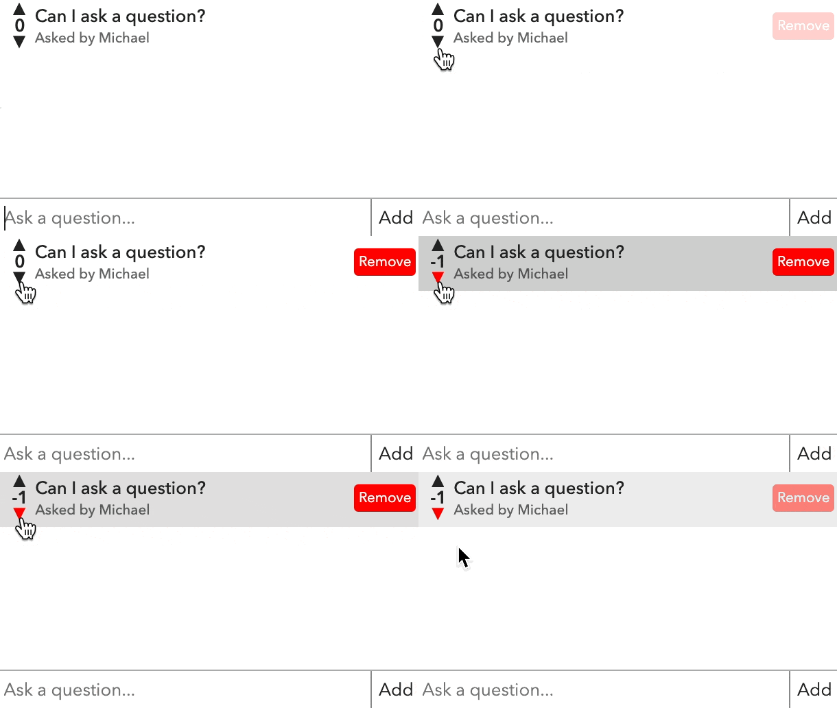
Allow Down Voting: Allow down voting for questions.
Allow Full Access User Tags: A comma-separated list of user tags that have full access to reactions regardless of other restrictions.
Allow Interaction: Whether to allow the users to interact with elements in the room preview.
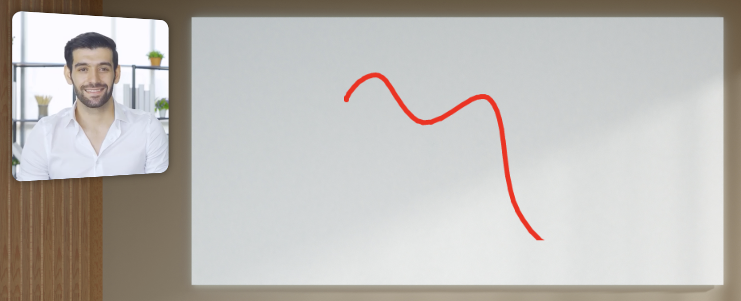
Allow Painting: Allow users to paint on the room.
Allow users to click to play/pause: Allows users to click the element to play/pause.
Allow Private Reactions: Allow users to send private reactions directly to other users.
Allow Rejoin: Allow users to rejoin the list and update their timestamp.
Allow Remove: Allow users to remove themselves after signing up.
Allow Reorder: Allow admins to reorder to list.
Allow Text Reactions: Allow users to send text reactions to all other users.
Allow Top Navigation: Allow the iframe to navigate the browser to other URLs.
Alternate Text: The alternate text for the image (eg the alt attribute in HTML).
Alternate URL: Alternate URL pointing to a specific asset.
Animate Transitions: Animate changes to the size or position of this element.
Animation Curve: What type of timing curve to use for animations of this element.
Animation Duration: How long to animation changes to size and position of this element (in seconds).
Apply For All Users: When the Apply on Condition is satisfied, apply the Action persistently to the database for all users.
ARIA Label: The ARIA label for this element.
Aspect Ratio: The aspect ratio of user video (e.g. 1.33 for 4:3).

Asset URL: An asset for the content of this iframe (allows for easier script editing).
Audience Auto-Rotation Enabled: Auto rotate the audience on a timed interval. Otherwise, the audience can be paged.

Audience Mode: Put this multi-user slot in audience mode where it holds all users in the room and displays "Audience Users" with video or audio unmuted.
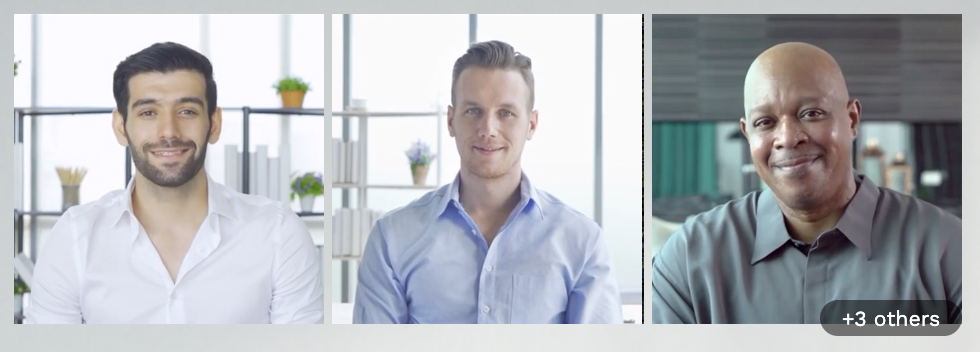
Audience Users: The number of audience members to be displayed.
Audience Rotation Time: The amount of time to wait before rotating audience members (in seconds).
Audience Show Count: In audience or meeting mode, show the total number of people in the video chat.
Audio Muted: Mute the audio of the user.
Audio Reaction Volume: The volume of audio reactions.
Audio Volume: The audio volume of the user. A number from 0.0 - 1.0.
Authorization: The authorization rule that grants user access to the space, e.g. anonymous, password, or sso.
Auto-Fit Text: Automatically size text to fit text box.
Auto-Join Priority: The order in which users join this element versus others. 0 is the highest priority (i.e. first assigned) and larger numbers are lower priority.
Auto-Join Stream Type: The type of stream (camera or screenshare) that can autojoin this element.
Auto-Join Tag Filter: If set, comma-separated list of tags. Only users with these tags are allowed to autojoin.
Autoplay (Media Element): Select Yes to have the media autoplay and No to stop it.
Autoplay (Music): Autoplay live music.
Background: A CSS-specifier for the background of the room. You can specify colors (eg "red", "blue") or use RGB (e.g. "#ff0000" or "rgba(255, 0, 0, 1)").
Background Color: Uses CSS color syntax (eg "red", "blue") or RGB (e.g. "#ff0000" or "rgba(255, 0, 0, 1)").
Background Color Type: The type of color to apply to the background of this Room.
Background Gradient End Color: The gradient end color to apply to the background of this Room.
Background Image: The asset or URL of the background image for this Room.
Background Media: A background image or video for the landing page.
Background Opacity: The opacity (aka alpha) of the background image or video. A number from 0.0 - 1.0 (where 0.0 is transparent and 1.0 is opaque).
Background Size Mode: How the background image/video should cover the Room.
Background Spec: The background specification.
Background Video: The asset or URL of the background video for this Room.
Background Video Volume: The audio volume of the background video for this Room.
Backpack Enabled: Enable backpack functionality for the workspace.
Badge Alignment: How the badge should be aligned on the user.
Badge from Backpack Tag: The tag of an item from users' backpacks to show as a badge.
Badge Height: The height of the badge as a percentage of the height for the user.
Badge Show Count: Show a count of the items in the back with the matching tag.
Badge Width: The width of the badge as a percentage of the width of the user.
Banned Users: The email addresses of users banned from this workspace.
Blur: Adjust the amount of blur in user video.
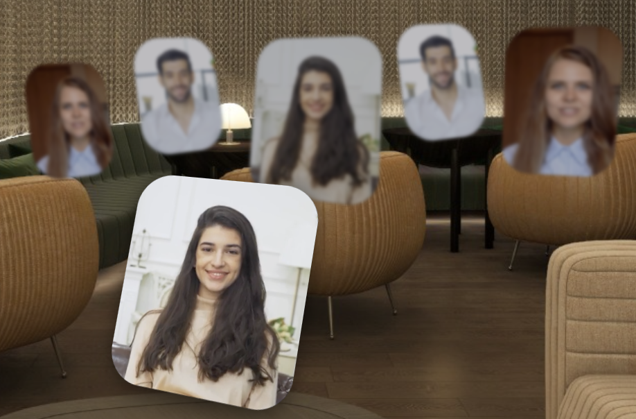
Blur in Recording: Blurs the contents of this element in workspace recordings.
Border Color (Element): The border color for the element. Uses CSS color syntax (eg "red", "blue") or RGB (e.g. "#ff0000" or "rgba(255, 0, 0, 1)").
Border Color(User Slot): The border color for user videos.
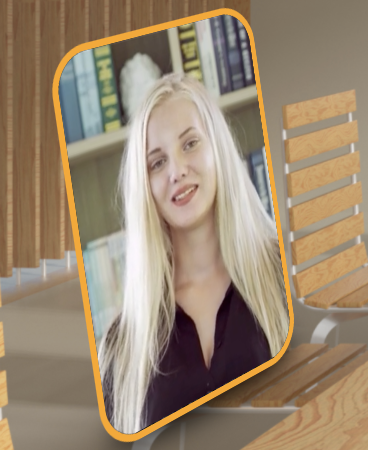
Border Radius: The border radius for user videos. Could be in pixels (eg. 5px) or percentage (eg. 50%).
Border Style: The style of the border.
Border Width(Element): The width of the border.
Border Width(User Slot): The border width for user videos. Could be in pixels (e.g. 5px) or percentage (e.g. 50%).
Box Shadow: The shadow for users in this chat. Specified in CSS format with pixels and color: "horizontal-offset vertical-offset blur color" (eg. "1px 1px 5px rgba(0, 0, 0, 0.5)").
Breakout Button: Allows users to break out into another room with the user in this element.
Brightness: Adjust the brightness. 0 is completely dark, 1 is normal, 1+ is extra bright.
Camera Preview Corner Radius: The corner radius of the camera preview on the landing page as a percentage of the height.
Capacity Limit: Maximum number of people allowed to be in the workspace. A full error message will show if new users try to join.
Channel: Setting a channel links chat elements across the workspace. Put the same value into other chat elements to link them to the same channel.
Chat Input Background Color: Background color of the chat input box.
Chat Input Color: Color of the text in the chat input box.
Chat Input Placeholder Color: Color of the placeholder text in the chat input box.
Chat Input Placeholder Text: Placeholder text in the chat input box.
Chat Link Color: The color of links in messages. Uses CSS color syntax (eg "red", "blue") or RGB (e.g. "#ff0000" or "rgba(255, 0, 0, 1)") .
Chat Message Background Color: Background color of the area that shows messages in a chat box.
Chat Message Color: Color of messages that appear in the chat box.
Chat Message Font Size: The size of the font of the message in pixels. It is scaled according to the room width and height.
Chat Message Line Height: The line height of the font of the message, as a multiplier (e.g. 1.5) .
Chat Reaction Bar Background Color: Background color of the reactions bar.
Chat Sender Color: Color of sender of messages that appear in the chat box.
Chroma Hue Max: The maximum hue value to key out.
Chroma Hue Min: The minimum hue value to key out.
Chroma Key Out: Whether the element should try to chrome key out a range of colors.
Chroma Saturation Max: The maximum saturation value to key out.
Chroma Saturation Min: The minimum saturation value to key out.
Chroma Value Max: The maximum value to key out.
Chroma Value Min: The minimum value to key out.
Circle Layout Arc Length: How much of a circle the users are placed on.
Circle Layout Arc Start: Where on the circle the arc should start.
Circle Layout Distance From Center: How far from the circle center users should be placed.
Circular/Elliptical(Element): Make your element completely round.
Circular/Elliptical(User slot/ multi-user slot: Whether users should be completely round.

Click Only Non-Transparent Pixels: Only allow clicking on the non-transparent parts of the image.
Click to Copy to Clipboard: Copies the text to the clipboard when clicked.
Click to Fullscreen: Allows users to make the element fullscreen for themselves.
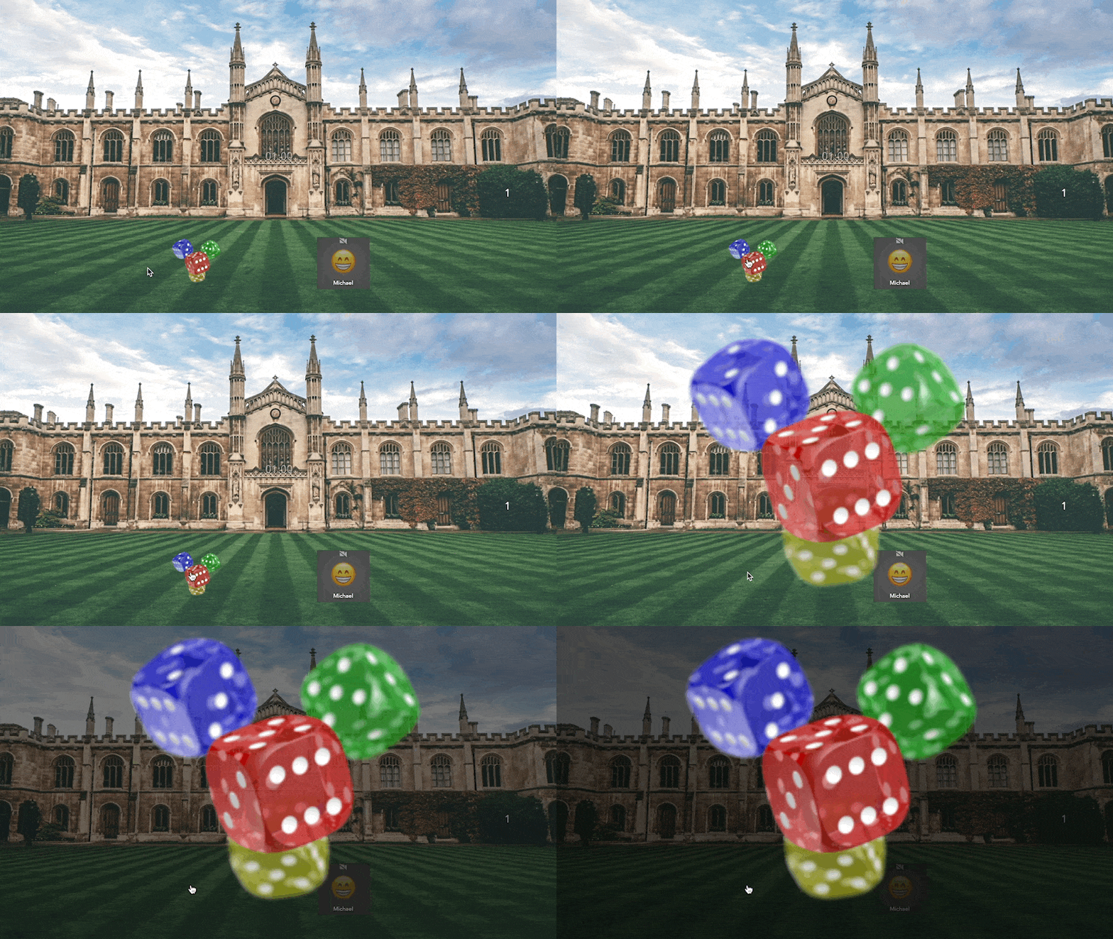
Click to Fullscreen Makes Opaque: When the user clicks to fullscreen, overrides opacity to 1.
Closed Caption Input Id: Id of the input element to display.
Collect speaker metadata during recordings: If enabled, metadata on who is speaking will be collected during recordings.
Color Matrix: Modify the colors of the element using a 5x5 RGBA color matrix. The syntax is r1 r2 r3 r4 r5 g1 g2 g3 g4 g5 b1 b2 b3 b4 b5 a1 a2 a3 a4 a5.
Column Margin: The margin for the columns of names.
Column Width: The width for the columns of names. 0 is autosize.
Config: Configuration for shuffling.
Confirm on Run: If enabled show a confirmation dialog before running.
Confirm Text: If confirm is enabled, the popup text on the confirmation dialog.
Confirm Text Choices: Comma-separated list of choices for the confirmation dialog (ok,cancel).
Contrast: Adjust the contrast. 0 is completely flat, 1 is normal, 1+ is extra high contrast.
Cooldown Secs: Number of seconds to cool down after taking picture.
Corner Radius: The radius of the corners for this element in pixels.
Count: The count of users in this element.
Countdown Completed: Whether the countdown is completed.
Countdown Completed Text: The text to display when the countdown is complete.
Countdown Date: The target date to count down towards.
Countdown Secs: Number of seconds to count down before taking pictures.
Countdown Time: The target time to count down towards.
CSS Border: A CSS-specifier for the border of this element (e.g. "solid 1px white"). Override all other border properties.
CSS Border Radius: A CSS-specifier for border radius for this element. Could be in pixels (e.g. 5px) or percentage (e.g. 50%). Overrides Corner Radius.
CSS Box Shadow: The shadow for this element. Specified in CSS format with pixels and color: "horizontal-offset vertical-offset blur color" (e.g. "1px 1px 5px rgba(0, 0, 0, 0.5)").
CSS Filter: A CSS filter to be applied to the element (e.g. "blur(5px)"). Overrides all other filtering.
CSS Matrix 3D: The CSS matrix3d transform to apply to the element. Hold down 'd' to edit visually.
CSS Text Shadow: The shadow for this text in this element. Specified in CSS format with pixels and color: "horizontal-offset vertical-offset blur color" (e.g. "1px 1px 5px rgba(0, 0, 0, 0.5)").
CSS Transform: A CSS transform to be applied to the element (e.g. "rotate(90deg)"). Overrides other transform properties.
Current User in Queue: Is the current user in queue.
Current User Rank: The rank of the current user.
Custom Cursor Size: The size of the custom cursor in pixels.
Custom Message: A custom message to include in the doorbell notification.
Custom Reaction Excludes: A comma-separated list of custom emojis to exclude from the picker.
Default Type: The default type to use when there is no data.
Deletable: Enable users to delete this element from the room.
Director-only Admins: List of users who should be about to access high level controls and director mode.
Disable Follow(Workspace): Disable the follow feature for the entire space.
Disable Follow(Element): Disable the follow feature from the user in this element.
Disable Input: Disable input into this element.
Disable Live Broadcast: Disables the live room broadcast. Only broadcast room will be broadcast.
Disable Loading Static: Hides the static background when the media is loading.
Disable Space Music: Disable space-wide music, even if no music is playing in this room.
Disabled: Whether or not this button is disabled.
Discord Url: URL to post a message to when a user rings the doorbell.
Display Mode(Timer/Countdown): How to display the remaining time.
Display Mode(User List/Count): How to display the count of users.

Door State: The state of the door to this Room.
Door State User Tags: Restrict door state modification to specific user tags (comma-separated).
Drag On Transparent Pixels: Enable users to drag on transparent pixels in this image.

Draggable: Enable users to drag this element around the room. All users will see the element being dragged around in real-time.
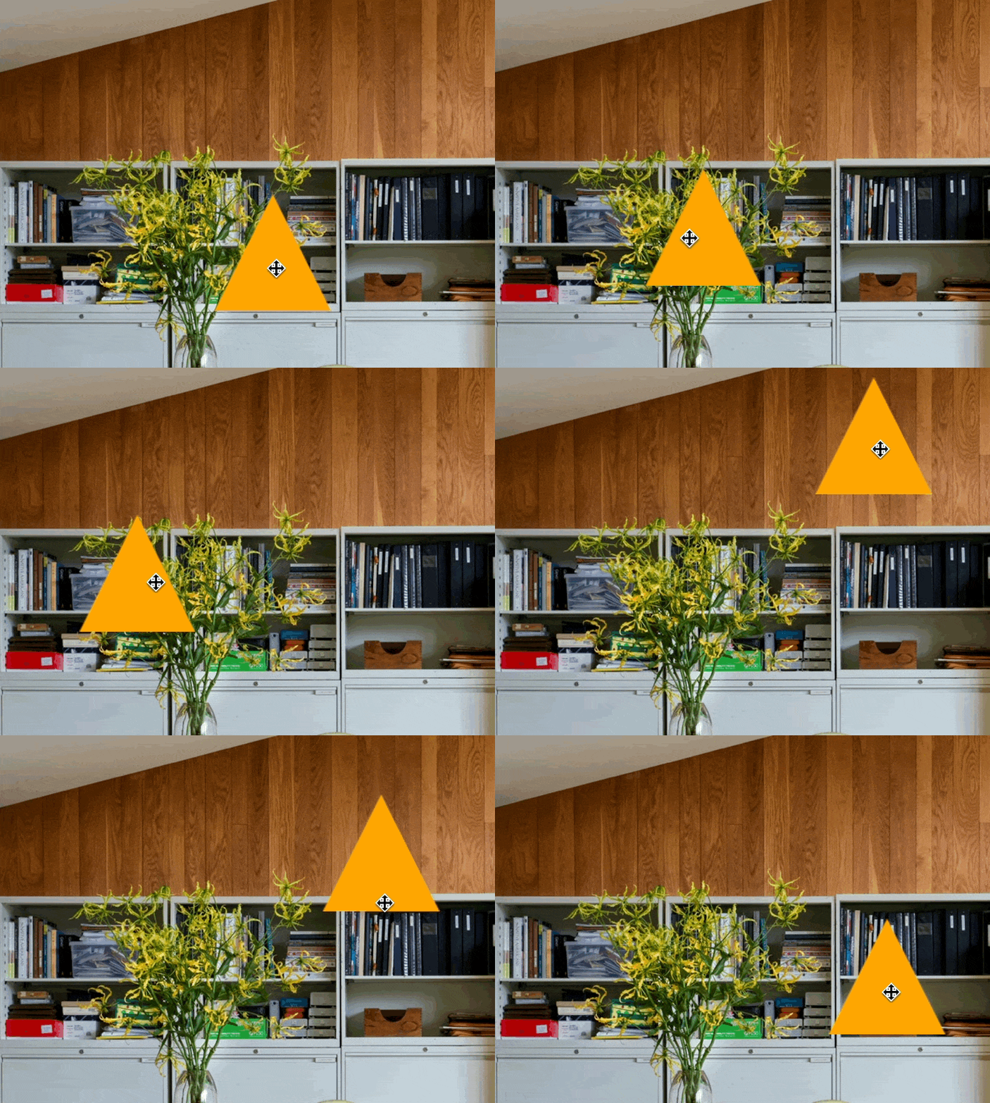
Draggable Limits: Limit the dragging range of this element.
Draggable Max X: Limit dragging in the X-axis to this maximum.
Draggable Max Y: Limit dragging in the X-axis to this maximum.
Draggable Min X: Limit dragging in the X-axis to this minimum.
Draggable Min Y: Limit dragging in the Y-axis to this minimum.
Draggable Snap to Grid X: If greater than 0, snaps the dragging coordinates to a grid of this many pixels.
Draggable Snap to Grid Y: If greater than 0, snaps the dragging coordinates to a grid of this many pixels.
Draggable Velocity: The velocity multiplier for the dragging of this element.
Draggable Y Scaling Factor: How much to scale this element while the user is dragging it along the y-axis.
Drop Action: A button element to invoke when this element is dropped.
Drop Shadow: Add a drop shadow to each user.
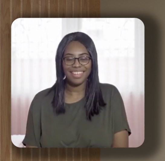
Drop Shadow: Add a drop shadow to this element.
Drop Shadow Blur: The blur of the shadow in pixels.
Drop Shadow Color: The color of the shadow.
Drop Shadow Spread: The spread of the shadow in pixels.
Drop Shadow X Offset: The X-axis offset of the shadow in pixels.
Drop Shadow Y Offset: The Y-axis offset of the shadow in pixels.
Emails: Comma separated list of emails to send email to when user rings the doorbell.
Enable Activity Feed: If enabled, a workspace-wide activity feed will be available to all users.
Enable Audio: Whether to enable the user and live music audio for this room preview.
Enable Audio Reactions: Allows users in the room to send audio reactions.
Enable Ban for User Tags: A comma-separated list of user tags that will be allowed to ban users.
Enable Chat Bar: If enabled, a chat bar on the left will be available with room and workspace chat.
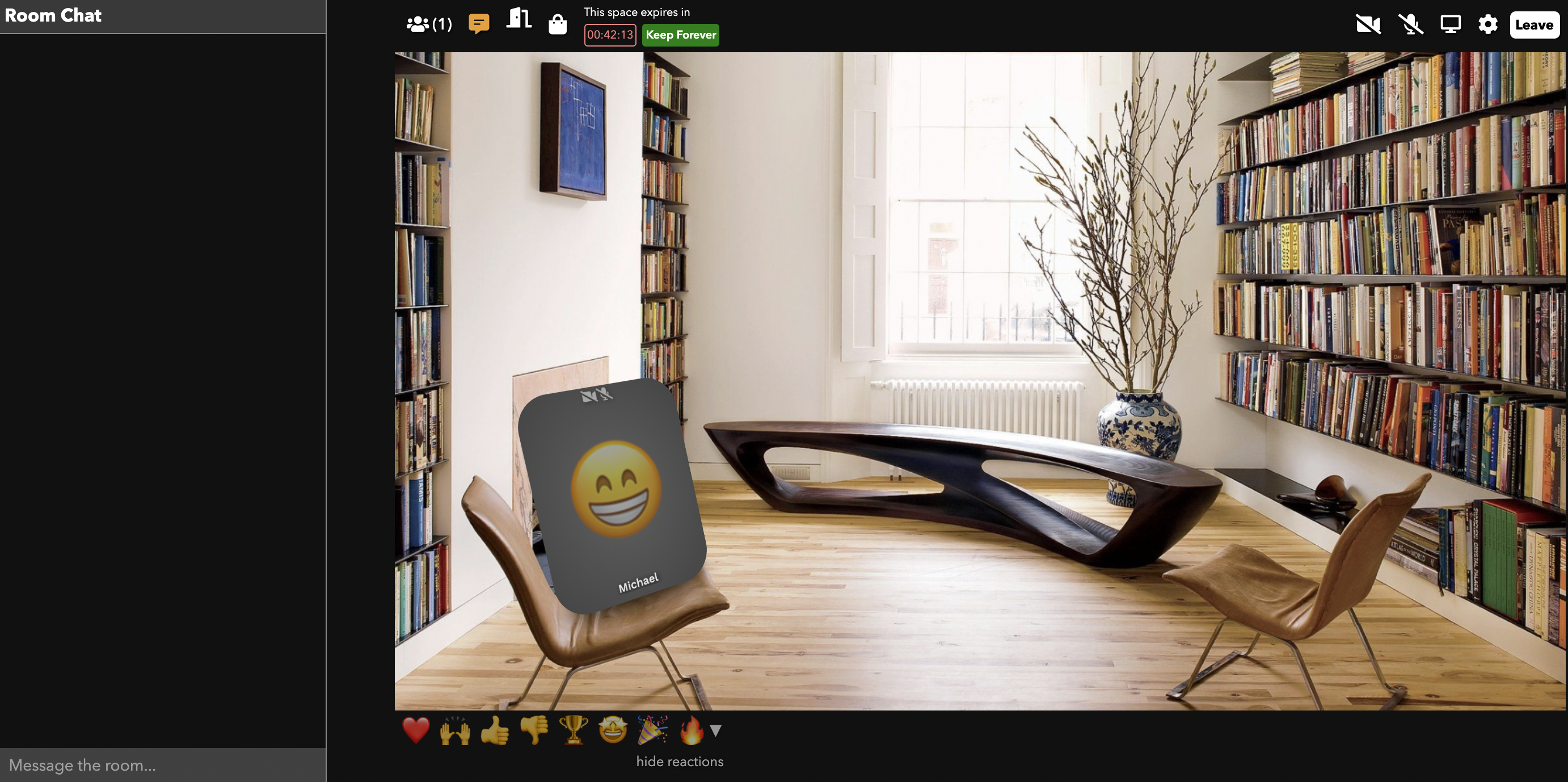
Enable Contact Info Exchange: Enable users to exchange contact information for elements in the workspace, except when overridden by the element.
Enable Notifications: Allow users to be notified via SMS by admins.
Enable Participant Controls for User Tags: A comma-separated list of user tags that will be mute/ban/etc other users.
Enable Participant Editing: Allow users to edit the contents of this element.
Enable Participant Previews: Enable admins to preview the streams of users in other rooms.
Enable Pop Out: If enabled, users can pop the element into a new, independently draggable and resizable window. Useful for images and screenshares.
Enable Reactions: Allows users in the room to send reactions.
Enable Room Listening: Enable admins to listen to users in other rooms.
Enable Room Navigation: Allow users to navigate across rooms in the workspace.
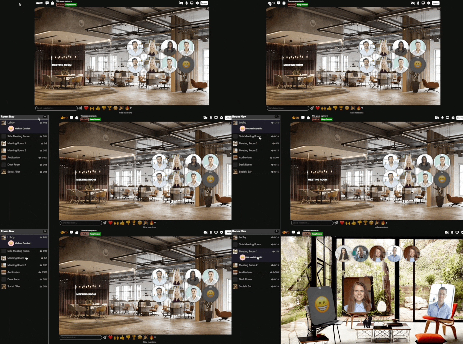
Enable Screen Share(Workspace Settings): Allow users to share their screens in the workspace. This can be overridden at a per-room level.
Enable Screen Sharing(Room Settings): Allow all users to share their screen (overrides the workspace setting).
Enable Search In Room Navigation: Allow users to search users in the room navigation bar.
Enable Shouting in Room Navigator: Enable users to shout across rooms.
Enable Shouting in Room Navigator Restricted to User Tags: Restrict the shouting in the Room Navigator to a comma-separated list of user tags.
Enable Sounds for Notifications: Enable sounds for notification and confirmation prompts.
Enable Stealth Mode: Enable admins to enter rooms without appearing, usually for live editing.
Enable Stereo Pan: Enables the stereo panner for this element. Requires refresh after enabling.
Enable Timezone Offset: Enable a fixed timezone for this clock.
Enabled: Controls whether or not the buzzer can be pressed.
Enabled URL: A URL pointing to an image to be shown when the buzzer has been buzzed.
Click "..." to upload a new image
End Action: A button element to invoke when the media in this element ends.
Event Time: The time of the event in milliseconds since Jan 1, 1970 UTC.
External Filter: The CSS filter to non-users outside of this chat (e.g. "grayscale() blur(5px)"). Useful if you want to create different "rooms" within the same room.
External Volume: The audio volume of this chat to non-users outside of this chat. A number from 0.0 - 1.0. Useful if you want to create different "rooms" of audio within the same room.
Fake Users: The number of fake users to show in the room for testing.
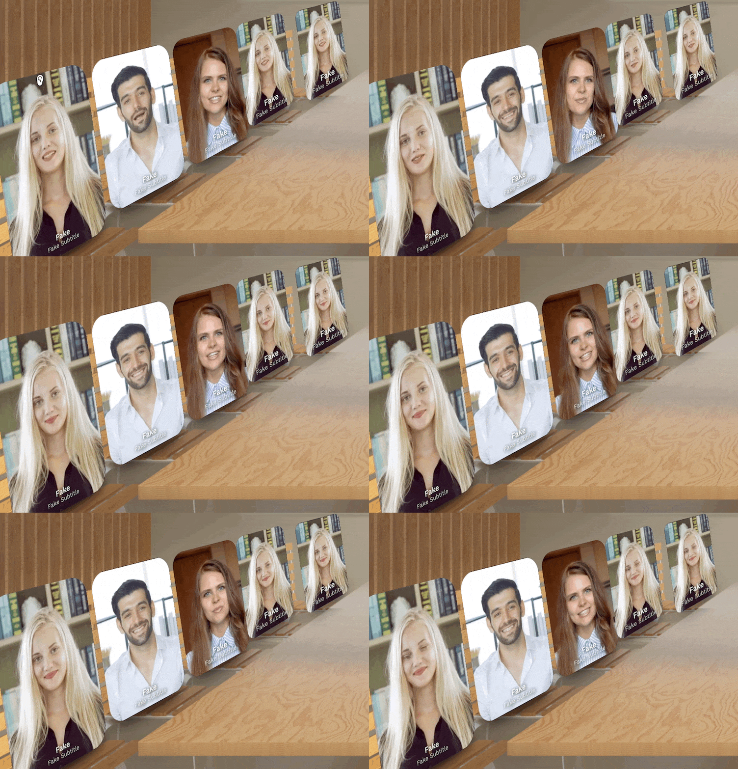
Fake Users Show for All Users: Show Fake Users to all users.
Feedback Prompt: The prompt text to show in the feedback dialog.
Feedback Title: The title to show in the feedback dialog.
First Names Only: Display only first names in the list.
Flipped: Show the alternate URL instead of the main one.
Font Family(Workspace Settings): The default font family.
Font Family(Element): The font to use for this element. Uses comma-separated CSS syntax (e.g. "Verdana, Arial, Helvetica"). Click on '...' to pick a font.
Font Family(Workspace Settings): The font for the landing page.
Font Size: The size of the font for this element in pixels. It is scaled according to the room width and height.
Font Weight: The weight of the font for this element in pixels in CSS syntax (e.g. "bold" or "500").
Force Landing Page: Force users to enter the workspace through the landing page.
Formatted Text: Use markdown for formatted text (overrides Text).
Fullscreen: Whether or not this element should occupy the entire room.
Fullscreen %: How much of the full screen this element should cover when full-screened. A number from 0.0 - 1.0.
Fullscreen Mode: Whether this element, when full-screened, should fully cover its space (clipping if necessary), or fit inside its space.
Fullscreen Offset X: How much of the full-screen element should be offset from center in the X-axis.
Fullscreen Offset Y: How much of the full-screen element should be offset from center in the Y-axis.
Fullscreen Scrim Opacity: The alpha/opacity of the scrim behind the fullscreen element. A number from 0.0 - 1.0.
Global User Specifier: Specifier string for which users should be mirrored into this slot.
Has User: Whether or not the element has a user.
Header Background Color: Text color for question board header.
Header Background Color With Unread Questions: Background color of the header bar if there are unread questions.
Header Color: The background color header of the chat element. Uses CSS color syntax (eg "red", "blue") or RGB (e.g. "#ff0000" or "rgba(255, 0, 0, 1)") .
Header Font Size: The size of the font of the header in pixels. It is scaled according to the room width and height.
Header Font Weight: The weight of the font for this element in pixels in CSS syntax (e.g. "bold" or "500").
Header Text Color: The color of the header text of the chat element. Uses CSS color syntax (eg "red", "blue") or RGB (e.g. "#ff0000" or "rgba(255, 0, 0, 1)").
Header Title(Chat): The title to display in the header of the chat element.
Header Title(Question Board): Text to display in the question board header.
Header Unread Color: The background color header of the chat element when there is an unread message. Uses CSS color syntax (eg "red", "blue") or RGB (e.g. "#ff0000" or "rgba(255, 0, 0, 1)").
Height(Element): The height of the element. It is scaled according to the room width and height.
Height(Room Settings): The height of the room in pixels.
Hide Activity Feed: Select Yes to hide the activity feed icon and box (if it is enabled in the workspace).
Hide Admin Peeking: Whether admins can listen in on this video chat while they are not in the chat.
Hide Capacity: When enabled, hides the room capacity in the room navigator.
Hide Countdown: Hide the full-screen countdown.
Hide In Room Preview: Do not render this element inside a room preview.
Hide Invisible Pictures in Editor: Hides invisible pictures in the strip while in the editor.
Hide invite button: Hides the invite user button for non-admins.
Hide Room Chat: Select Yes to hide the room chat on the left (if it is enabled in the workspace).
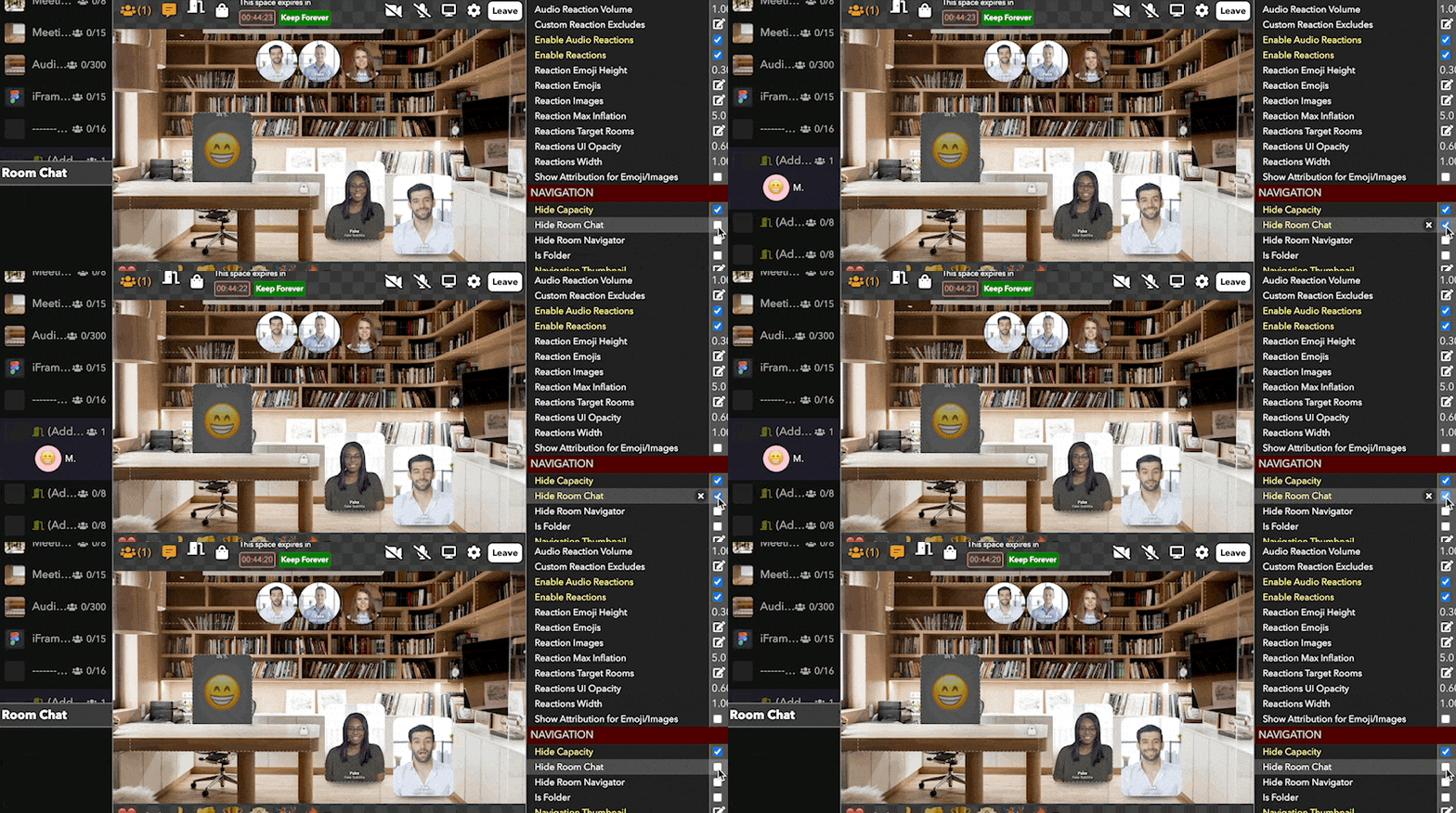
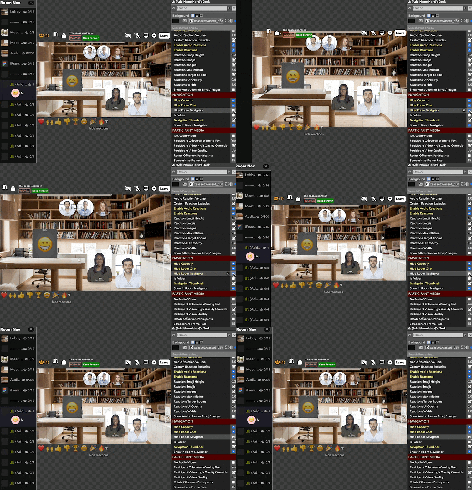
Hide Room Navigator: Select Yes to hide the navigation menu on the left (if it is enabled in the workspace).
Highlight Color(Element): The color of the highlight border for the element. Uses CSS color syntax (eg "red", "blue") or RGB (e.g. "#ff0000" or "rgba(255, 0, 0, 1)").
Highlight Color(Waiting List): The color of highlighted users in the queue.
Highlighted: Whether the element should be highlighted with a border.
Hour Hand Color: The color of the hour hand.
Hover Background Color: Uses CSS color syntax (eg "red", "blue") or RGB (e.g. "#ff0000" or "rgba(255, 0, 0, 1)").
Hue: Rotate the hue.
Icon Size: The size of the icon for user in room pixels.
In-App Help Discord Url: URL to post a message to when a user sends a help message to the help icon.
In-App Help Forwarding Enabled: Enable user in-app help requests to a Slack or Discord server.
In-App Help Phone Numbers: Phone numbers to send a text to when a user sends a help message via the help icon.
In-App Help Slack Url: URL to post a message to when a user sends a help message via the help icon.
Input Font Size: The size of the textbox of the message in pixels. It is scaled according to the room width and height.
Interactable Only By Self: Whether this element can only be dragged/rotated by this user.
Interaction Brings Element to Front: Whether the element is brought to the front of all other elements when interacted with.
Interaction Restricted to User Element: Whether this element can only be dragged/rotated/etc by the user in the specified element.
Interaction Restricted to User Tags: Whether this element can only be dragged/rotated/etc by users with the specified tags. Separate tags with commas.
Internal Volume: The audio volume of this chat to users inside of this chat. A number from 0.0 - 1.0. Useful if you want to create different "rooms" of audio within the same space.
Item Index: The index of the element in the source list.
Join Button Corner Radius: The corner radius of the join button on the landing page as a percentage of the height.
Join Button Text: The text of the join button on the landing page.
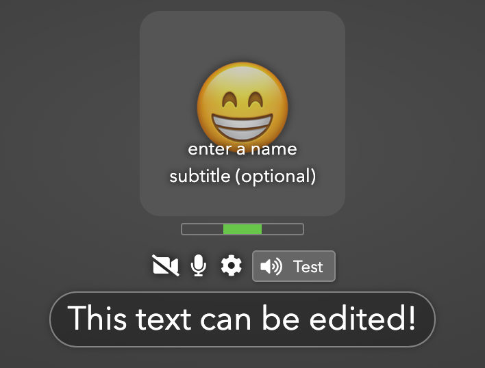
Join Mode: Whether users will automatically pop into this slot, or must click, or must be manually assigned.
Join Transition: The animation to use when a user joins the room.
JS Script (ALPHA): EXPERIMENTAL. Execute sandboxed JavaScript script.
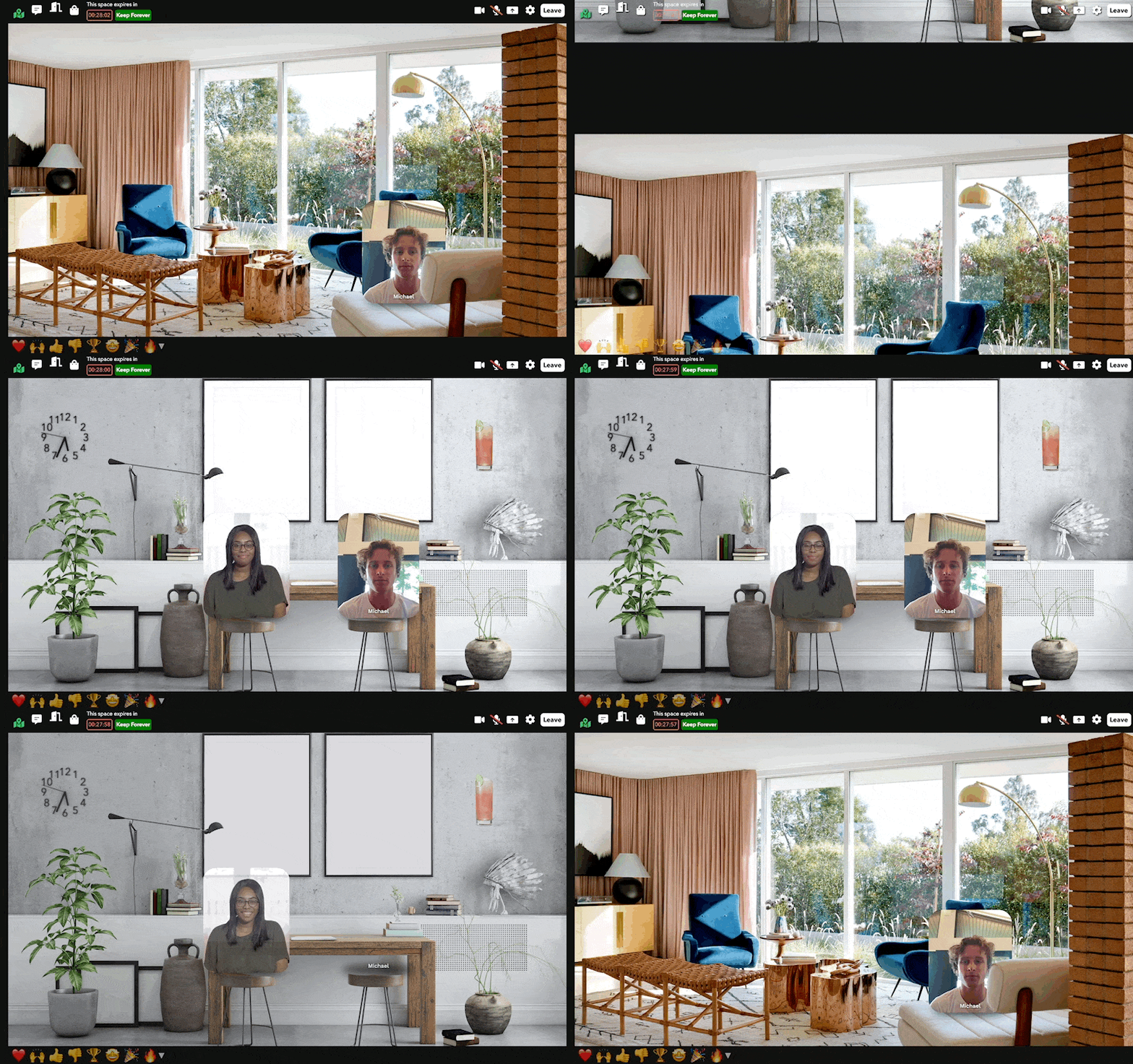
Layout Mode: How users should be arranged in this chat.

Leave Transition: The animation to use when a user leaves the room.
Levels - Blue: Adjust the blue level.
Levels - Green: Adjust the green level.
Levels - Red: Adjust the red level.
Line Height: The height of lines of text in the element in CSS syntax (e.g. "16px" or "1.5").
Link Only Non-Transparent Pixels: Only allow clicking on the non-transparent parts of the image.
Link Opens Same Window: Determines whether a link opens in the same tab or makes a new tab/window.
Link to Room: Whether clicking on a room preview takes a user to the given room.
Link URL: The URL to navigate the user to when the element is clicked.
Linked Asset: When clicked, opens any asset in a separate tab.
Linked Room: The room to navigate to when the user clicks the element.
Linked Room Transition: The transition animation to use when navigating to the room.
Live HLS Playback: Treats the input URL as a live HLS stream.
Live Music URL: A URL of music to play in the background of all rooms that do not already have live music.
Live Music Volume(Room Preview): The volume adjustment for the live music for the previewed room.
Live Music Volume(Room Settings): The volume of the background live music. A number from 0.0 - 1.0.
Live Music Volume Controls Workspace Music: Override the workspace music volume.
Locked: Locks the element so it cannot be selected in Edit mode by clicking on it.

Loop: Whether the media should restart automatically when playback is finished.
Map Room: If set to a room, use an overlay map instead of rooms list to allow users to navigate rooms.
Map Room Override: Use a different map room for this room.
Margin: The margin (in pixels) around the name and subtitle.
Margin Color: The color of the margin around the room canvas. Uses CSS color syntax (eg "red", "blue") or RGB (e.g. "#ff0000" or "rgba(255, 0, 0, 1)").
Marquee: When enabled, text will slide across the element like a marquee sign.
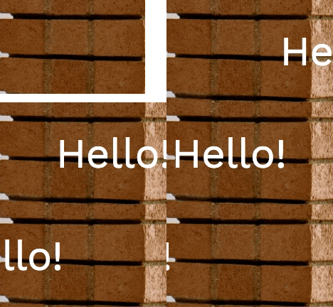
Marquee Duration: The length of time it takes for one marquee cycle to complete.
Mask Elements: Elements to use as a mask to this one.
Max Characters: The maximum number of characters allowed to be inputted.
Max Users(Multi-user Slot): The maximum number of people allowed inside this multi-user slot.
Max Users(Room Settings): Maximum number of people who can be in the room at one time. Others who try to join will get an error message.
Max Pictures: The maximum number of pictures to display.
Meeting Mode: Put this multi-user slot in meeting mode with arrows for paging through attendees, prioritization of users with audio turned on and playback of audio of all users with audio turned on, regardless if they are on screen.
Meeting Mode Users: The maximum number of users to show on-screen when in meeting mode.
Minimize To Top: When minimized, the header stays where it is instead of moving down.
Minute Hand Color: The color of the minute hand.
Mirror Mode: Whether users should be mirrored to everyone, only themselves, or no one.
Mirror User Element: If set, will create a duplicate video stream of the specific user slot.
Mix Blend Mode: Set CSS mix-blend-mode, controlling how the element blends with its parent.
Mode: Whether to run as a picture strip of a photo booth (along with a Take Picture element), or display captures taken by User Slots via the Capture Image invokable.
Modulo Base: The base to use for the modulo division.
Music End Time: The end time for the music, in seconds.
Music Start Time: The start time for the music, in seconds.
Mute Users on Enter: Automatically mute user microphones when they enter the room.
Name Margin: The margin (in pixels) around the name and subtitle.
Name Override: The name to overlay on the user.
Navigation Parent Room: The room in the navigator that holds the users in this room.
No Audio/Video: Make this a lobby-style room where people do not send live audio/video streams in.
Nook Click To Enter: Allow users to click to enter the nook.
Nook Room: Put userss that enter this multi-user slot into a "nook" for a more private conversation.
Nook User Tags Excludes: A comma-separated list of user tags that will be excluded from the nook.
Opacity: The opacity (aka alpha) of the element. A number from 0.0 - 1.0 (where 0.0 is transparent and 1.0 is opaque).

Origin: A CSS transform-origin to be applied to the element (e.g. "50% 50%").
Owning User Element: Only the user in the given element can interact with this element.
Padding: The amount of internal padding this element should have, in pixels. It is scaled according to the room width and height.

User Alignment: How users should be aligned in the box.
User Audio Volume: The volume adjustment for the users in the previewed room.
User Background Color: The background color for users in this chat. Uses CSS color syntax (eg "red", "blue") or RGB (e.g. "#ff0000" or "rgba(255, 0, 0, 1)").
User Count: The number of users currently in the multi-user slot.
User Count Suffix: The label to put after the user count in the chat header.
User Dragging: Allows video chat user to be dragged from element to element in the room.
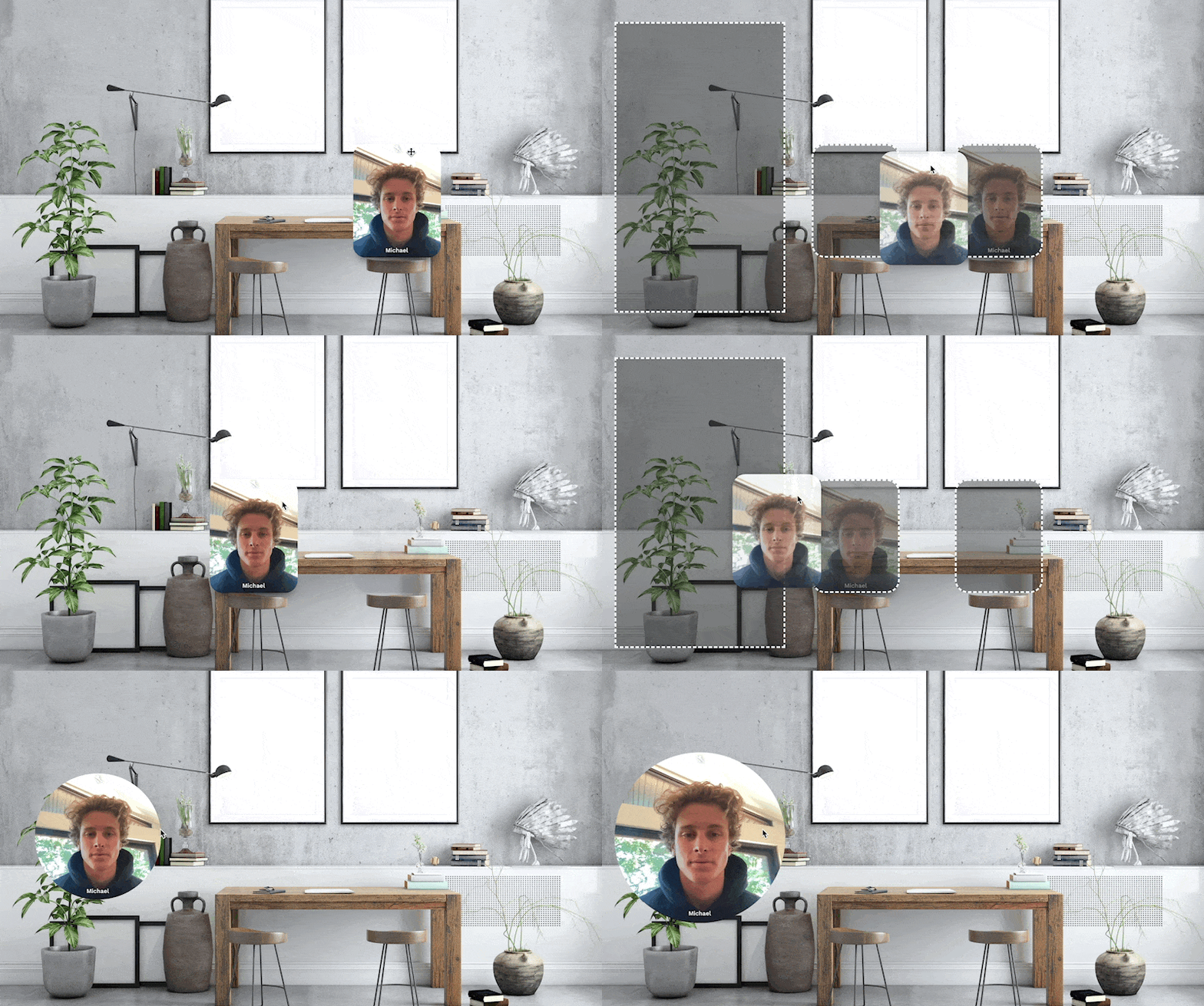
User Drop Target Background Color: The background color for dragged user drop targets.
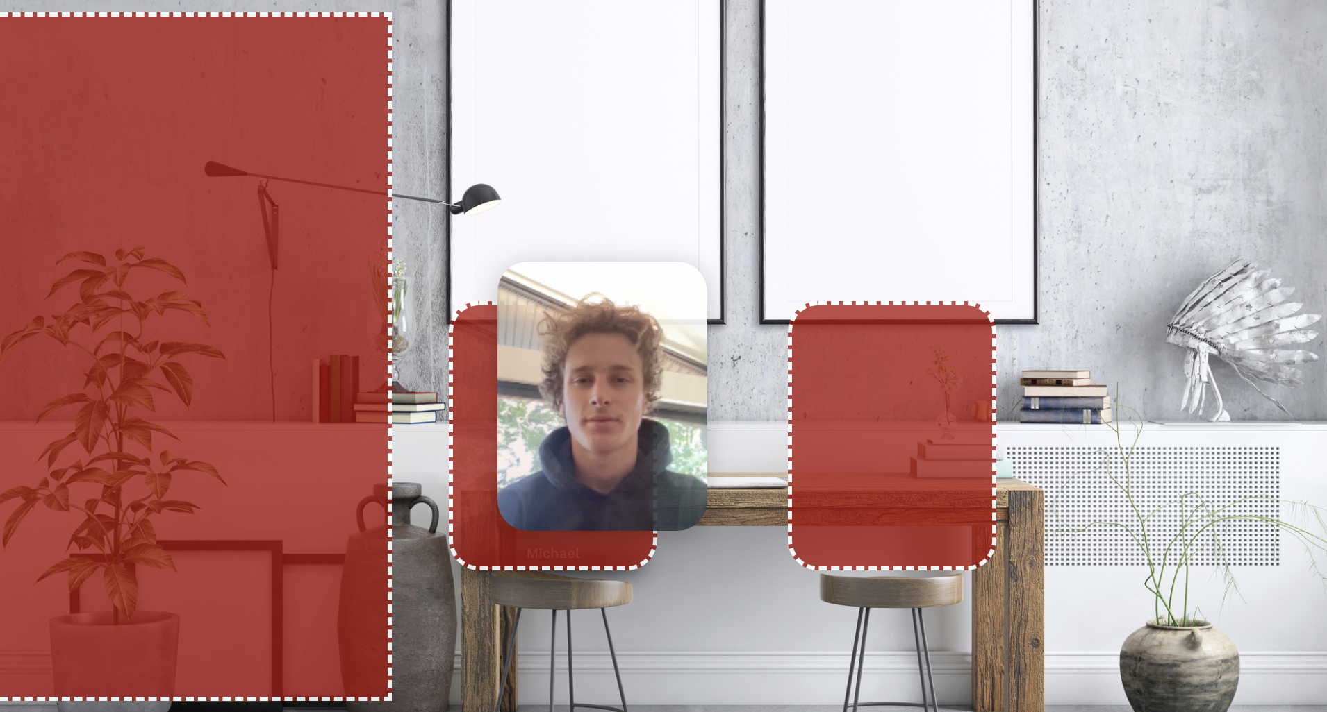
User Drop Target Border: The CSS border style for dragged user drop targets.
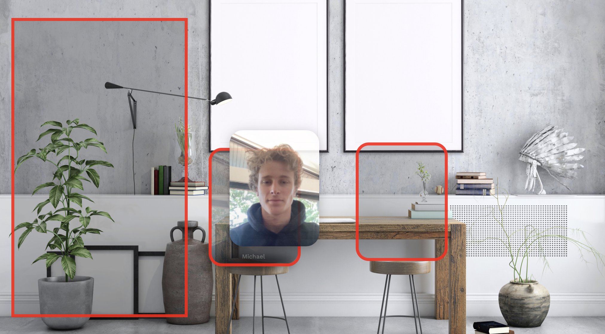
User Element: The User element with user to show this backpack item for.
User Highlight Color: Color to highlight each user.
User Highlighted: Highlight each user in the grid.
User Horizontal Alignment: The horizontal alignment of users using a Fixed Size layout.
User Layout Bend: The intensity of the curve that users are displayed in.
User Margin: The margin between user videos, in pixels. It is scaled according to the room width and height.
User Max Size: The maximum width or height (in pixels) of a user video in the grid.
User Offscreen Warning Text: The text to show to a user if they are offscreen.
User Tag Excludes: Filter the users to those who do not have one of these tags.
User Tag Filter: Filter the users to those who have one of these tags.
User Thumbnail Interval: How often users should upload image thumbnails.
User Thumbnail Only: Only show a thumbnail image for the user instead of video. The room needs to have User Thumbnail Interval set to a non-zero value for this to work.
User Thumbnail Quality: The thumbnail resolution that users will publish
User Timezone: Use the timezone of the user in the specified element.
User Vertical Alignment: The vertical alignment of users using a Fixed Size layout.
User Video High Quality Override: A list of user tags for users who will publish at higher quality.
User Video Quality: The default video resolution that users will publish to the workspace. For spaces with smaller user slots, use lower quality for better performance.
User Width: The width of each user element using a Fixed Size layout.
Users Rotation Time: The amount of time to wait before rotating users (in seconds).
Users to Mix: The number of users to play audio for.
Perspective: The perspective view for a 3D transformed element as a % of the room width.
Perspective Shadow: Add a perspective shadow to the element.

Perspective Shadow Angle: The angle of the shadow in degrees.
Perspective Shadow Blur: The blur of the shadow in pixels.
Perspective Shadow Color: The color of the shadow.
Perspective Shadow Height: The height of the shadow as a percentage of the element size.
Perspective Shadow Offset: The offset of the shadow as a percentage of the element size.
Perspective Shadow Width: The width of the shadow as a percentage of the element size.
Phone Numbers: The list of phone numbers to message.
Picture Height: The height of the captured photo. If unset, the room height is used.
Picture Strip Fade Out Delay Secs: Number of seconds before pictures in the picture strip fade out.
Picture Width: The width of the captured photo. If unset, the room width is used.
Placeholder Color: Color of the placeholder text.
Placeholder Text: Text to show when an editable text field is empty.
Play on User Enter: Play media automatically when any user enters the room.
Play Sound for Text: Whether to play a sound when a text notification is sent.
Playback Rate: How fast the media should play. A number from 0.0 - 1.0.
Playing: Select Yes to have the media play and No to stop it.
Post Message Arg: A string to pass to as the argument to the call to postMessage to the iframe contents.
Prevent Concurrent Execution: Only allow one user to be running the Action at a time.
Prompt for Camera and Mic: Prompt the user to enable camera and/or microphone when joining this element.
Property Affector Tag Filter: Only affect elements tagged with this tag.
Property Affector X: The X position for affecting properties where 0.5 is the center.
Property Affector Y: The Y position for affecting properties where 0.5 is the middle.
Property Affectors: Affect the values of other elements' properties based on distance from this element.
Question Font Size: Font size for the question.
Random Seed: Set a fixed random seed so all the random numbers are always in the same order.
Range Maximum: Exclusive maximum of this random source.
Range Minimum: Inclusive minimum of this random source.
Rank Digits: The number of digits to show in the rank.
Reaction Emoji Height: How high the reaction emojis will float on the canvas: 0 being the bottom of the screen and 1 being the top.
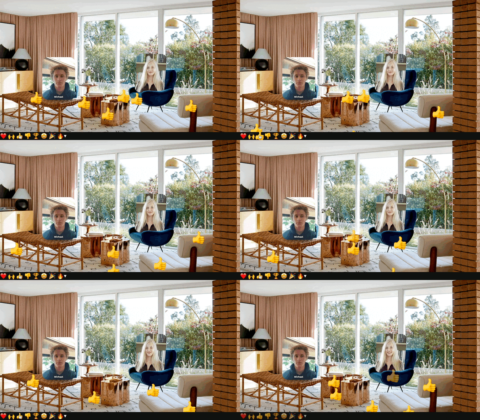
Reaction Emojis: The default reaction emojis for all rooms.

Reaction Images: A list of custom reaction images.
Reaction Max Inflation: The maximum inflation for reaction emojis.
Reactions Allow Full Access User Tags: A comma-separated list of user tags that have full access to reactions regardless of other restrictions.
Reactions Placeholder Text: The text to display in the text reactions input field.
Reactions Target Rooms: Send reactions sent from this room to the specified target rooms.
Reactions UI Opacity: Controls the default opacity of the reactions UI for all users.
Reactions Width: How much of the width of the canvas the reactions can occupy: 0 being just the right side and 1 being the whole canvas.
Referers: Restrict to HTTP Referers.
Refresh Interval (secs): How often the iframe should auto-refresh, in seconds.
Region: The region the communications server should be hosted in. You should choose the region closest to the majority of your users.
Remove Users Invokable Tag Filter: Tag filter of users to remove when remove Users is invoked.
Repeat Action: Repeatedly apply the action (for animations etc).
Repeat Delay: How much to delay between repeats of the action.
Require Camera On (only for global preview): For global preview elements, restrict to users with camera on.
Reset on Pause: Select Yes to have the media start over when you pause it.
Reset on Play: Select Yes to have the media start over when you play it.
Resizable: Whether the users can resize this element.
Resizable Max Height: The maximum height for resizing.
Resizable Max Width: The maximum width for resizing.
Resizable Min Height: The minimum height for resizing.
Resizable Min Width: The minimum width for resizing.
Restrict Access to Select Users: Only allow select users or users with specific tags to access the room.
Restrict Access User Tags: User tags for specific users who are allowed to access the room.
Restrict Access Users: User emails for specific users who are allowed to access the room.
Result Background Color: Uses CSS color syntax (eg "red", "blue") or RGB (e.g. "#ff0000" or "rgba(255, 0, 0, 1)").
Ring Text: The text to display when the doorbell rings.
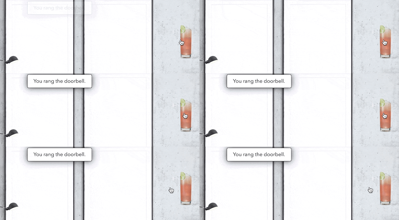
Ring URL: The audio file to play when a user rings the doorbell.
Ring When User Enters: Notifies when a user enters the room.
Room IDs: The list of rooms to count/list.
Room Mood: The mood playlist to use.
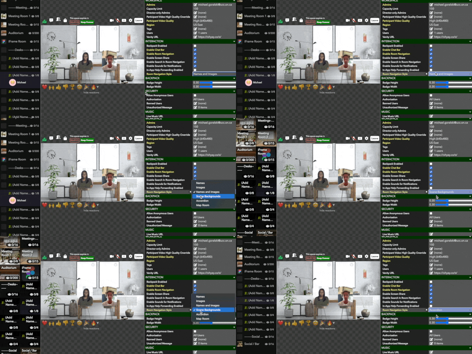
Room Navigation Style: The UI style of the Room navigation menu.
Room Tags: A comma-separated list of room tags to count/list.
Room to Preview: The room to preview in this element.
Room Transition: Specifies the effect to use when transitioning to this room.
Rooms to Mix: The list of rooms to mix users' audio.
Rooms to Search: The list of rooms to search for users. Leave blank to search all rooms.
Rotatable: Whether participants can rotate this element. All users will see the element being rotated in real-time.
Rotate Offscreen Element Tags: A comma-separated list of element tags. If set, restrict rotation to autojoin elements that have one of these tags.
Rotate Offscreen Users: For any users that are in the audience in the room, periodically rotate them into autojoin user elements.
Rotate Offscreen Users Time: Time interval for rotating audience members into autojoin user elements, if enabled in the room.
Rotate X: The 3D rotation around the X-axis.
Rotate Y: The 3D rotation around the Y-axis.
Rotate Z: The 3D rotation around the Z-axis.
RTMP Key Suffix: The key suffix to use for this RTMP stream.
RTMP Low Latency: Enables low-latency mode for RTMP. May result in playback stalls.
Run on User Enter: Runs the action when a user enters the Room. Can be used in conjunction with Run Atomically to create room entry triggers. It can be run conditionally if Apply on Condition is used.
Saturation: Adjust the saturation.

Scale X: The scaling along the X-axis.
Scale Y: The scaling along the Y-axis.
Scheduled Date: The date of the event to display to users in their own timezone.
Scheduled Start Times: A list of times of day to restart the video (times in your local timezone).
Scheduled Time: The time of the event to display to participants in their own timezone.
Scheduled Time Display: A string used to format the displayed time.
Scheduled Time Format: How to display this scheduled time (formatting syntax is http://blog.stevenlevithan.com/archives/date-time-format).
Screen Sharing Email List: Enable a select set of users to share their screen (overrides the workspace setting). Allows all users if empty.
Screen Sharing User Tags: Enable a select set of users to share their screen based on user tags.
Screenshare Frame Rate: The frame rate at which screenshares will be streamed in frames per second.
Screenshare Resolution: The resolution at which screenshares will be streamed.
Second Hand Color: The color of the second hand.
Seconds Elapsed: The seconds elapsed in the stopwatch.
Seconds Remaining: The seconds remaining when a timer is running.
Seek Time: Time to seek to when seek is invoked.
Selected Background Color: Uses CSS color syntax (eg "red", "blue") or RGB (e.g. "#ff0000" or "rgba(255, 0, 0, 1)").
Send Channel: The MIDI channel to send on when the button action is executed.
Send Message Type: The MIDI type to send when the button action is executed.
Send Note: The MIDI note to send when the button action is executed.
Sepia: Adjust the sepia level.
Show Admin Controls: Allow admins to control the audio and fullscreening of users.
Show All Users: Show all users in the space when the search input is focused.
Show Audio Indicator: Show the audio level for users as a flashing border.
Show Audio Indicator Color: The color of the flashing border for user audio levels.
Show Audio Indicator Glow Width: The width of the glow for user audio levels.
Show Audio Indicator Width: The width of the flashing border for user audio levels.
Show Avatars: Show users' emoji avatars next to their messages.
Show Capacity: Whether to show the capacity of the rooms.
Show Controls: Show play/pause controls to admins or everyone.
Show Controls to Non-Admins: Show playback controls to all users. (versus just admins).
Show Door UI: Show the UI to close/lock/open doors.
Show Door UI Colors: Colors the door state icons in the scene navigator.
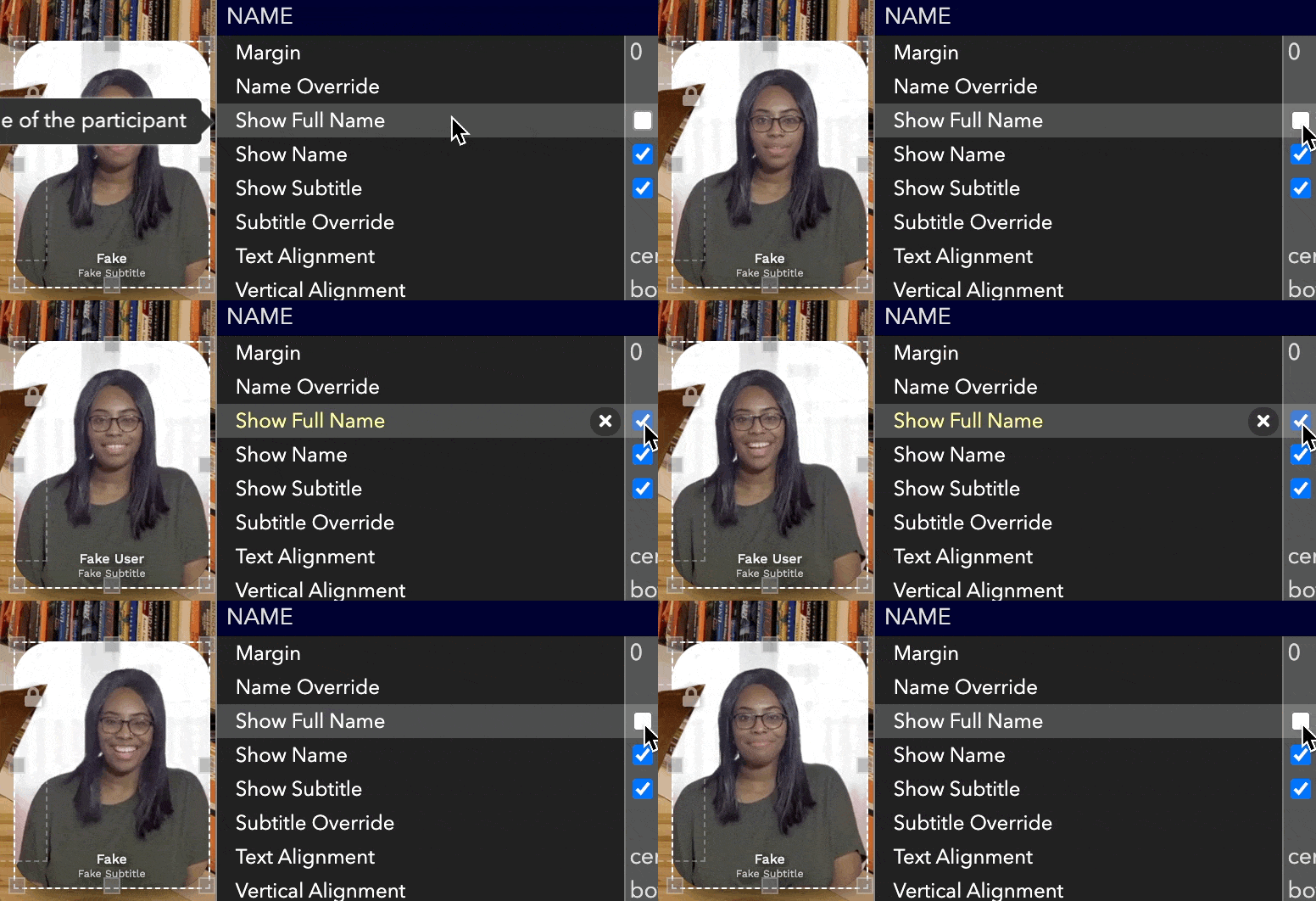
Show Full Name: Show the full name of the user.
Show Header: Show the header to users.
Show in Room Navigator: Select Yes to have the Room available in the Room Menu and No to hide it.
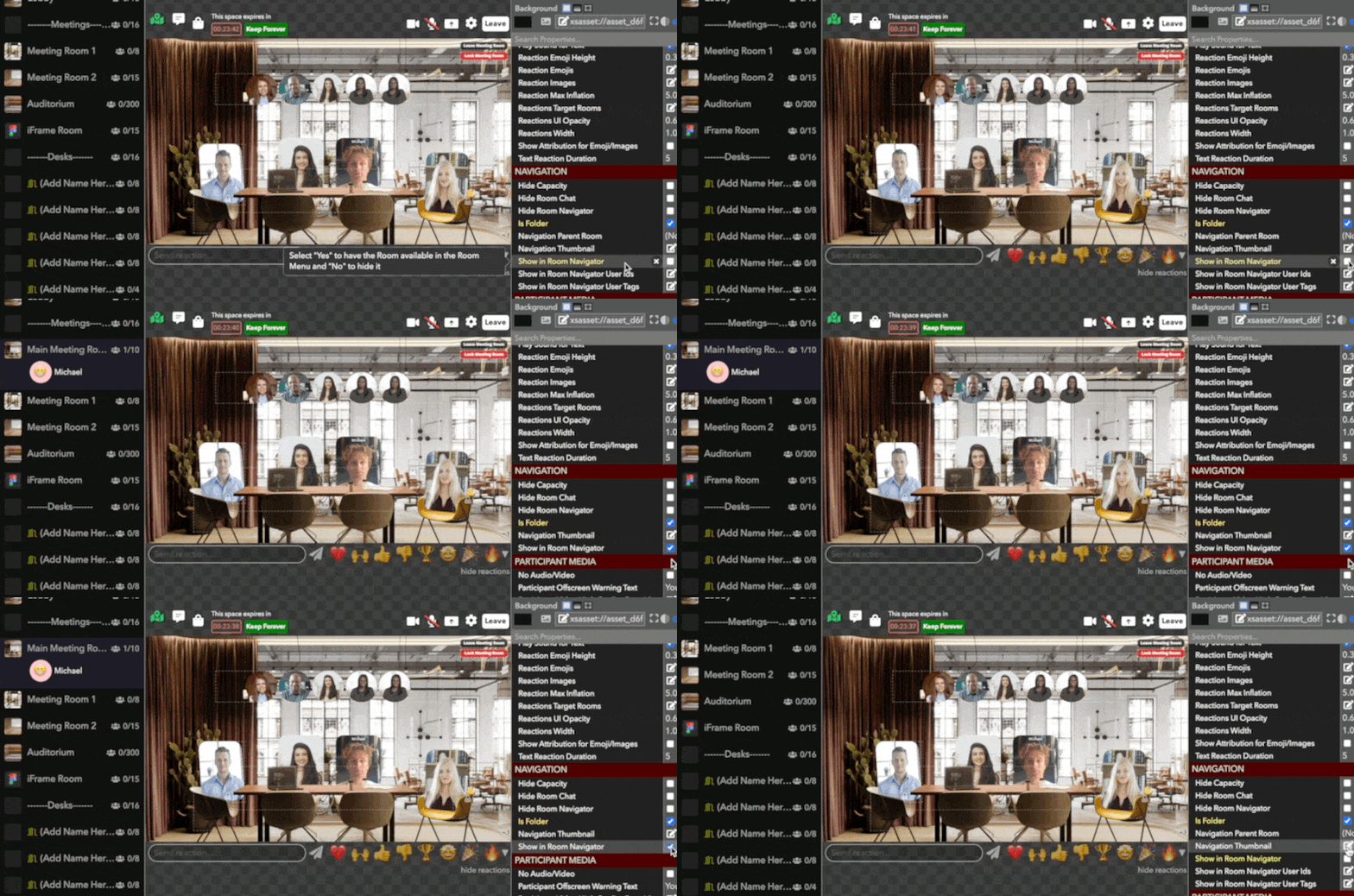
Show in Room Navigator User Ids: If room is hidden from navigator by default, show it for these users.
Show in Room Navigator User Tags: If room is hidden from navigator by default, show it for users with these tags.
Show Loading Text: Show Loading Text when shuffle button is clicked.
Show Minimize Button: Allows users to minimize the chat down to just its header.
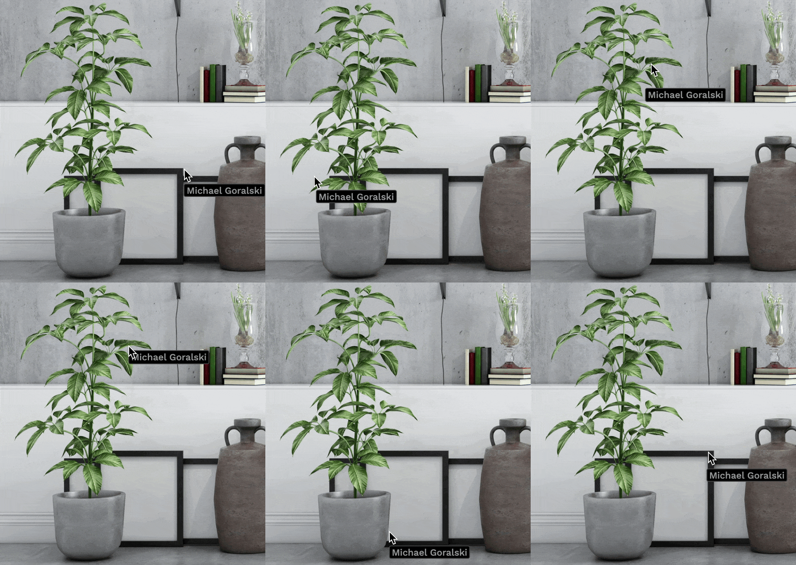
Show Mouse Pointer Full Name: Displays the full name of users on their mouse pointer.
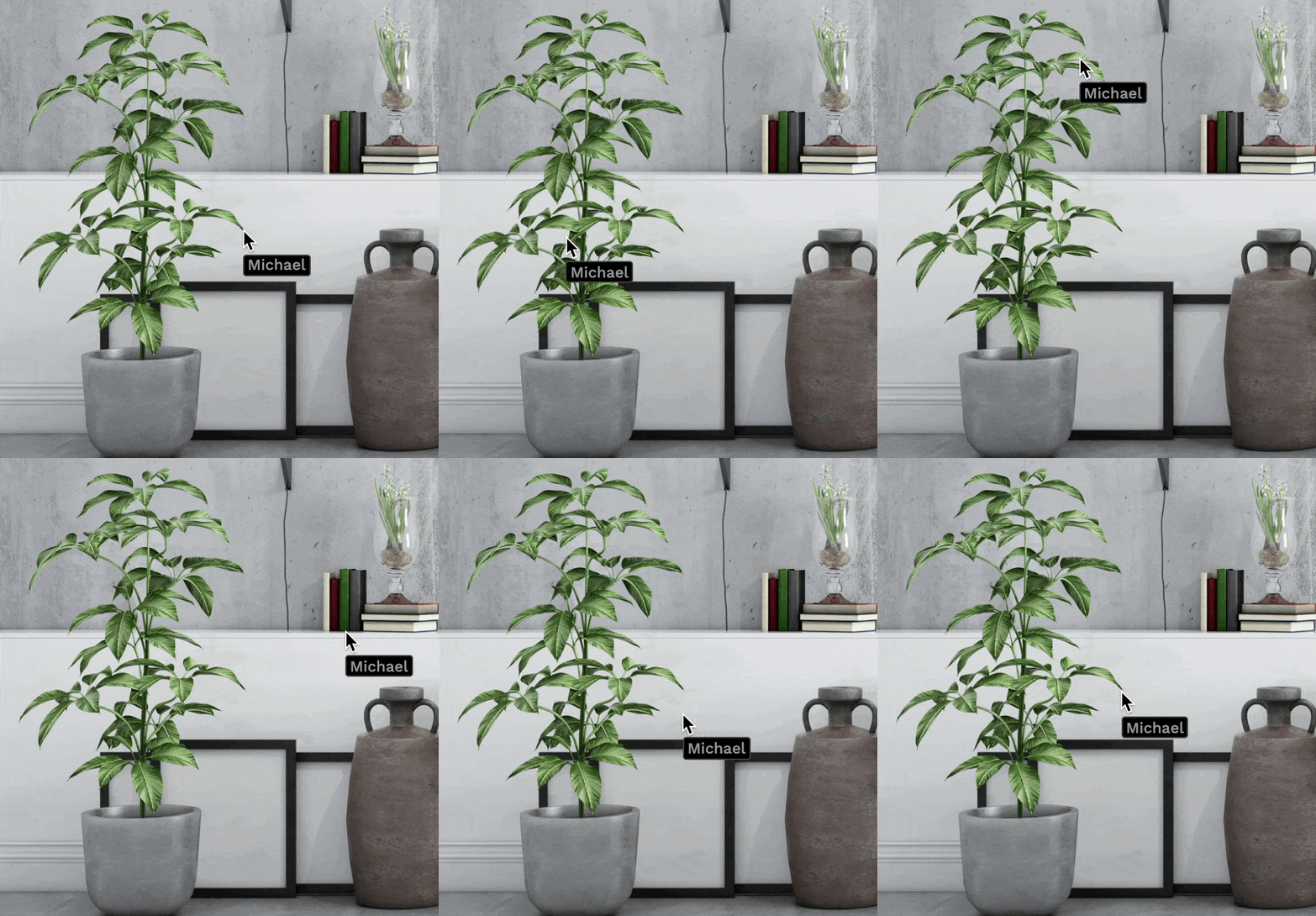
Show Mouse Pointers: Displays the mouse pointers of all users in the room while the pointer is moving.
Show Mouse Pointers Tag Filter: Restrict mouse pointers to users with these tags.
Show Mute States: Show the camera and mic mute states for users.
Show Name: Show the name of the user
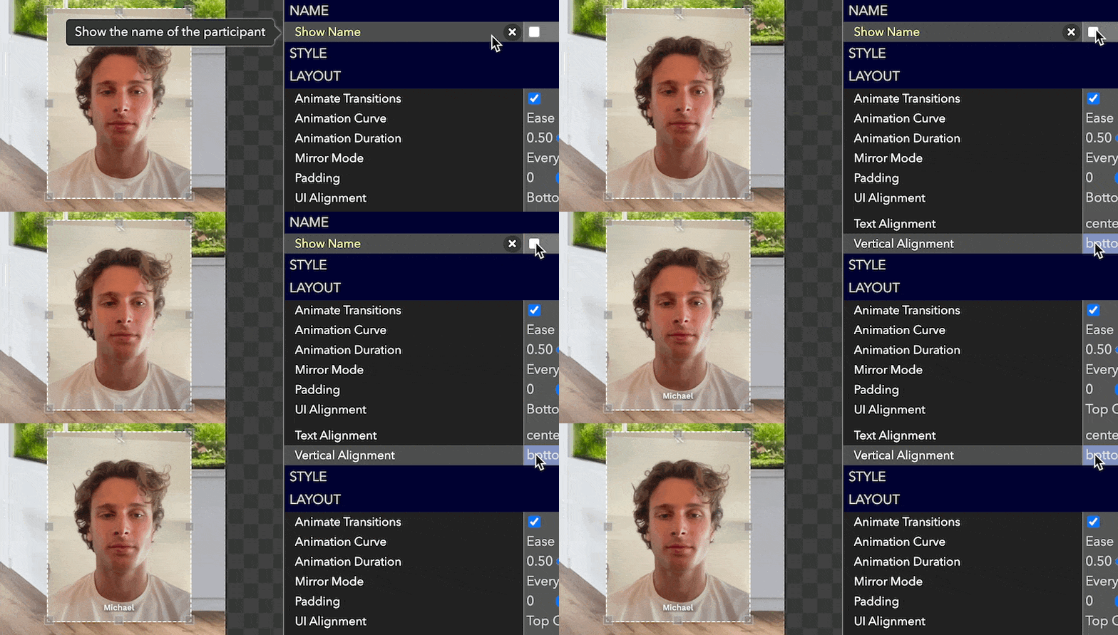
Show Names on Hover: Whether to show all names in a tooltip on hover.
Show Native Controls: Show the browser's native controls. Only for unsynced media.
Show Negative Time: The negative time after the timer hits zero.
Show Users on Landing Page: Show User names on the landing page of the workspace.
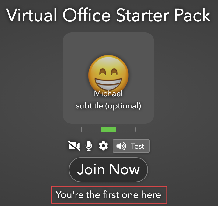
Show Rank: Show the rank the user.
Show Reset Button: Show a reset button that can be clicked by any user.
Show Seconds: Show seconds in the display.
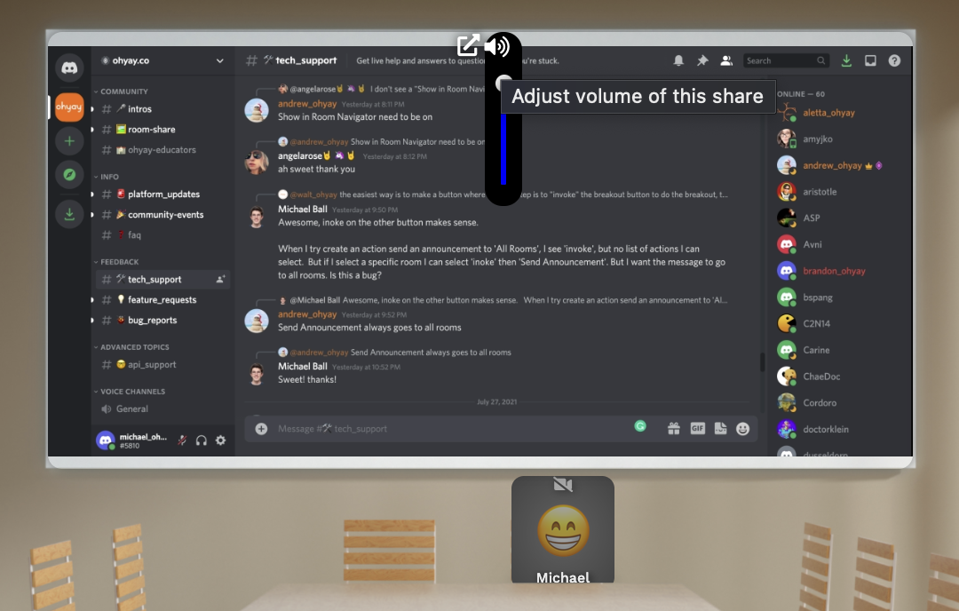
Show Share Volume: Whether to automatically show a shared volume slider on shares.
Show Slide Count: Show the total count of slides in the slideshow.
Show Slide Number: Show the current slide number in the slideshow.
Show Subtitle: Show the subtitle of the user.

Show Time: Show the time the user started waiting.
Show Time Since: The base time for Show Time.
Size Mode: Whether this element should fully cover its space (clipping if necessary) or fit inside its space.
Skew X: The skew along the X-axis.

Skew Y: The skew along the Y-axis.

Slack Url: URL to post a message to when a user rings the doorbell.
Slide Controls: How to display the slide controls.
Slide Duration: The duration for each slide when playing.
Slide Number: The slide to show, starting at 1.
Source Element: The source to draw data from.
Spatial Audio Volume: Changes audio volume of users based on distance from each other on screen.
Spatial Audio Volume Distance: How far on the room users can hear each other as a percentage of the room size.
SSO Domains: Comma separated list of domains to use for authentication.
SSO Provider: Provider for SSO access.
Start Date: If set, show how much time has passed for each user since Start Date and Time.
Start Time(Timer): The start time in ms since epoch for this timer.
Start Time(Waiting List): If set, show how much time has passed for each user since Start Date and Time.
Start URL: The URL to load in this element.
Stereo Pan: Sets the stereo pan for audio in this media element. -1 is left, 1 is right.
Subtitle Override: The subtitle to overlay on the user.
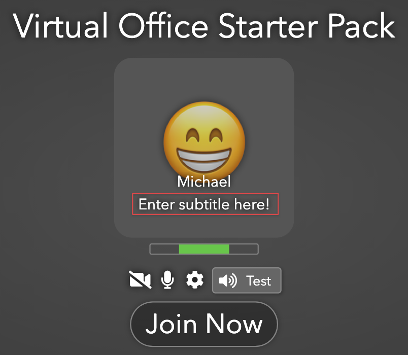
Subtitle Prompt: The prompt shown to users for entering their subtitle.
Tab Index: The tab index for this element. A value of "-2" means not set.
Tag Filter: Show a count of the tagged items in a backpack.
Tag Filter: The tag of a backpack item to show in this element.
Tags: A comma-separated list of tags that can be used for searching/scripting/etc.
Take Clone: Clone this element and put the clone in the user's backpack when taken.
Takeable: Allow users to take this item and put it in their backpack.
Target Element: The element to set the property on.
Target Room: The room to clone using the provided data.
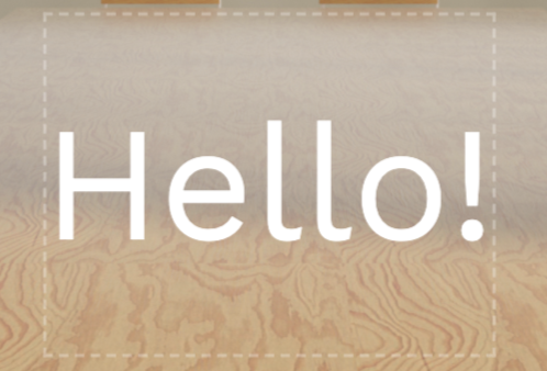
Text: The text to be displayed in this element.
Text Alignment(User Slots): The horizontal alignment of the name and subtitle.
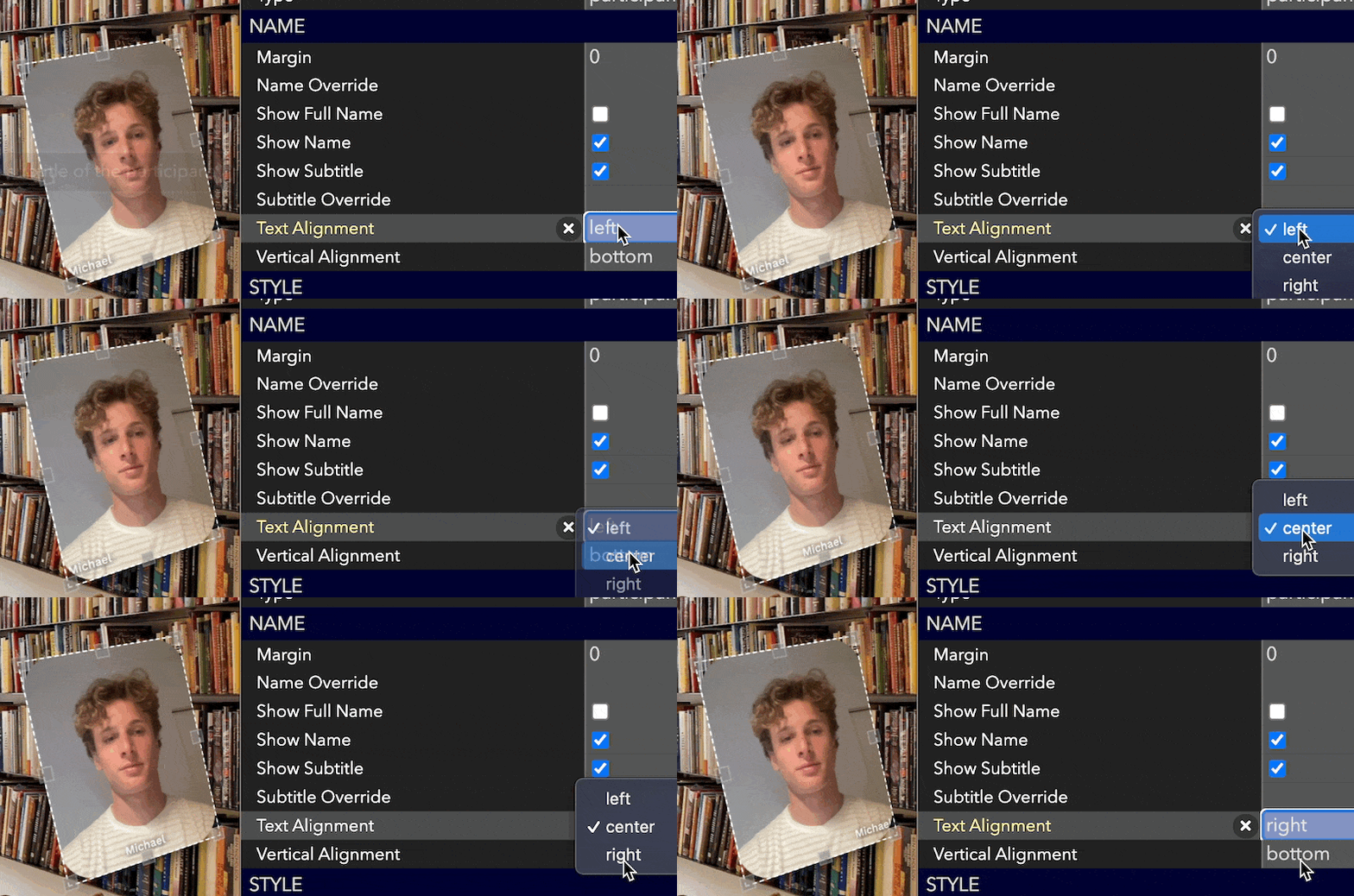
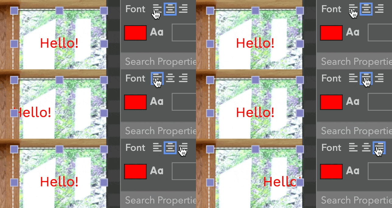
Text Alignment(Text Element): The horizontal alignment of the text.
Text Background Color: The background color to apply to the text.
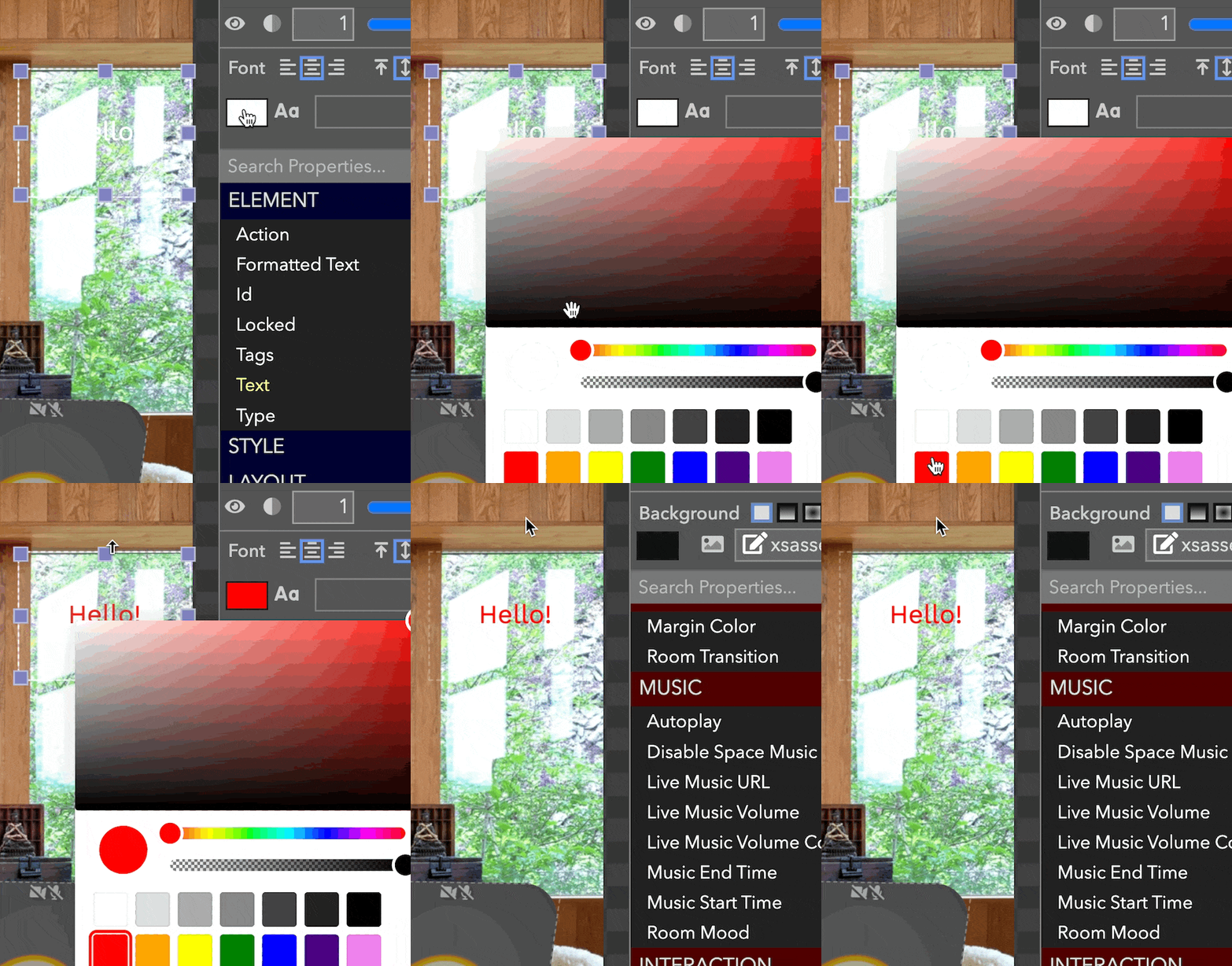
Text Color: The text color for the element. Uses CSS color syntax (eg "red", "blue") or RGB (e.g. "#ff0000" or "rgba(255, 0, 0, 1)").
Text Decoration: Decoration. Try "underline", "overline", "line-through".

Text Padding: The amount of padding to apply to the text.
Text Shadow: Add a text shadow to this text in this element.

Text Shadow Blur: The blur of the shadow.
Text Shadow Color: The color of the shadow.
Text Shadow X Offset: The X-axis offset of the shadow.
Text Shadow Y Offset: The Y-axis offset of the shadow.
Timer Completed Text: The text to display when the timer is complete.
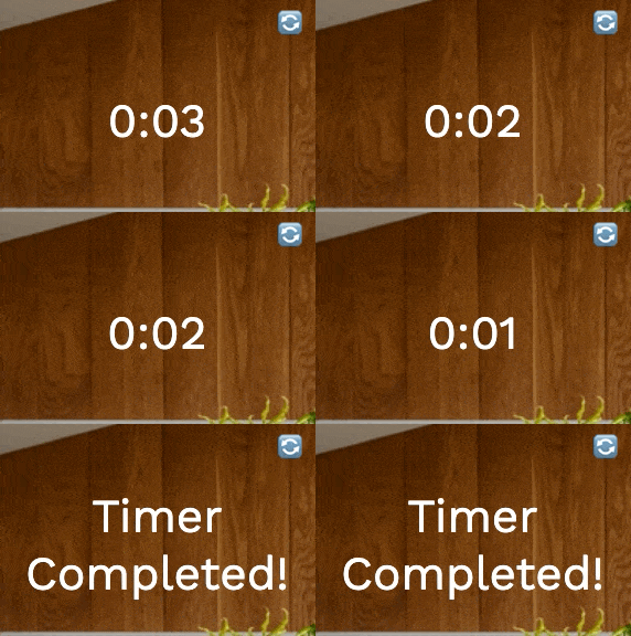
Timer Duration (secs): The duration of the timer in seconds.
Timer Running: Whether the timer is currently running.
Timezone Offset from UTC: The offset from UTC in minutes.
Title(Room): The title of the room.

Title(Workspace): The title of this workspace.

Trigger Channel: The channel to listen to for MIDI triggers.
Trigger Message Type: The MIDI message type that triggers the action.
Trigger Note: The note to listen to for MIDI triggers.
UI Alignment: Specifies where UI (e.g. popout buttons) for the element will appear.
Unsynced Playback: Do not play in sync, let the user control their own playback with native controls only. Play/pause/reset will only work locally for the user who invokes these actions.
URL(Buzzer Element): A URL pointing to an image to be shown when the buzzer has not been buzzed.
Click "..." to upload a new image.
URL(Image elements): URL pointing to a specific asset.
Use RTMP: The source of this video is backed by an RTMP source.
Users Changed Action: A button to run when the users in this waiting list change.
Users Follow Live Room: Whether all the users in the space (except pinned) will be automatically moved to the live room (indicated by the red dot in the Rooms List) when the live room is changed.
Value: The constant value to use.
Value Name: The name of the value to select.
Vertical Alignment(User Slots): The vertical alignment of the name and subtitle.

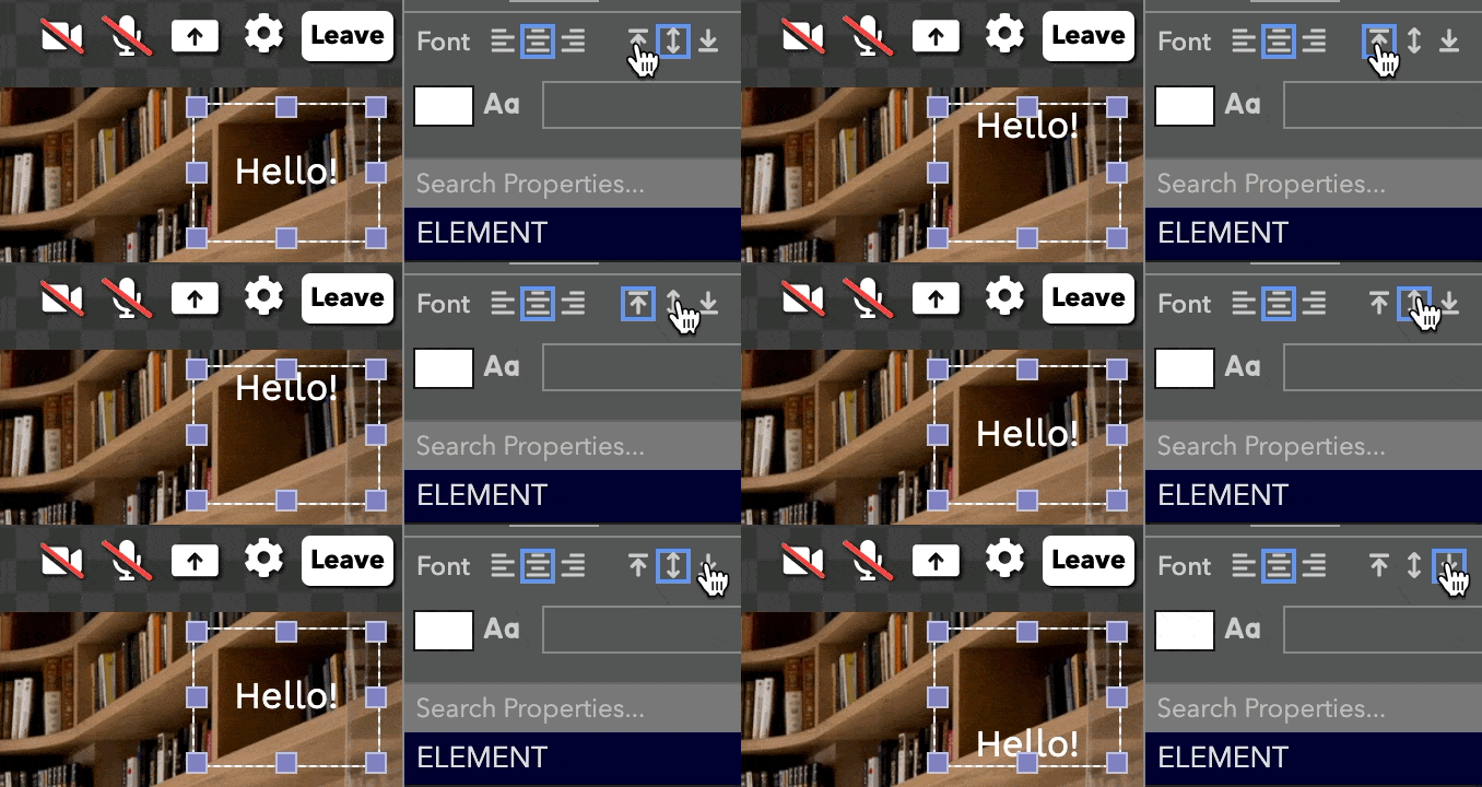
Vertical Alignment(Text Element): The vertical alignment of the text.
Video Quality Override: Override the video quality for the user in this slot. If you want to use resolution higher than 640x480, make sure the user has also modified their camera capture resolution setting to match the required resolution.
Video URL: The video to start playing.
Visible: Make the element visible to users.
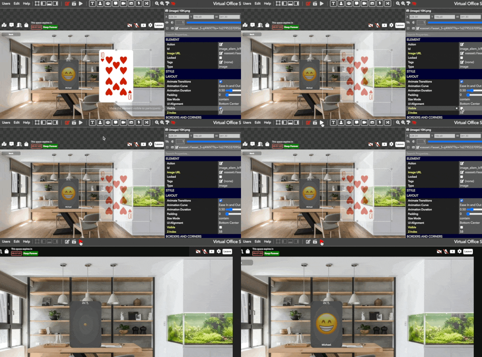
Visible for # of Users: Show this element only when there are a certain number of users in the room.
Visible for # of Users in Room: Show this element only when there are a certain number of users in the specified room. If empty, uses the current room.
Visible for User Element: The ID of the user element this element is bound to. It will only show if that element has an online user. It will show to everyone, though. If you want to show the element only to certain users, use "Visible For Condition".
Volume: The audio volume of the media. A number from 0.0 - 1.0.
Volume Fade Time: The number of seconds to fade in/out the volume.
Width(Room): The width of the room in pixels.
Width(Element): The width of the element. It is scaled according to the room width and height.
Word Wrap: Whether the text should wrap.
Workspace IDs: The comma-separated list of workspace IDs.
X: The X coordinate for the position of the element. It is scaled according to the room width and height.
X Picture Offset: Offsets captured photos by this many pixels in the X direction.
Y: The Y coordinate for the position of the element. It is scaled according to the room width and height.
Y Picture Offset: Offsets captured photos by this many pixels in the Y direction.
Z-Index: The z-index of the element, controlling which element is on top of other elements.
Zoom: The zoom of the video.
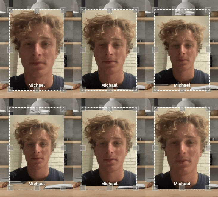
Zoom Left: The zoom left position of the video.
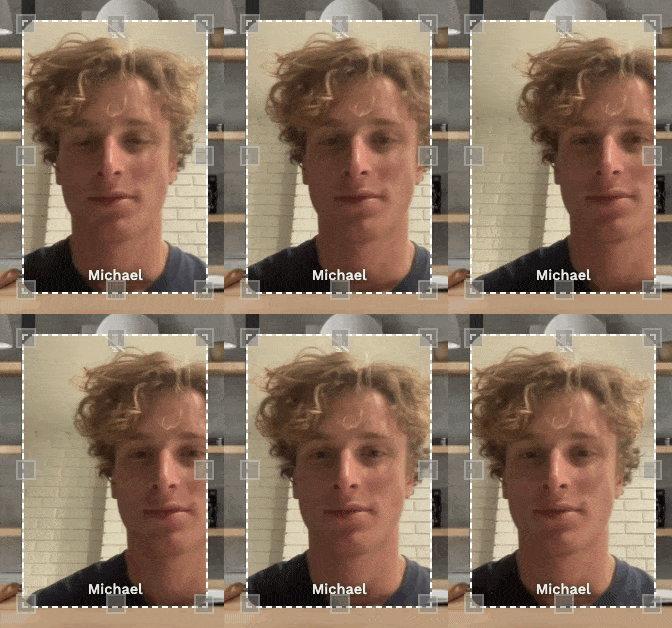
Zoom Top: The zoom top position of the video.
Updated almost 4 years ago
